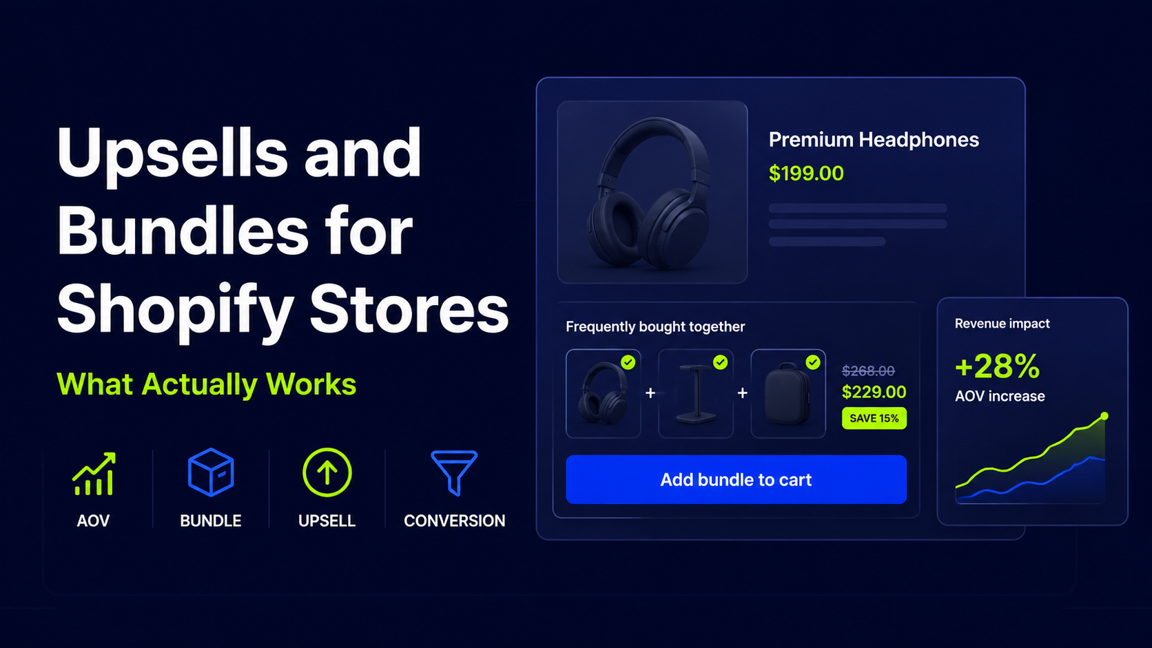
Upsells and Bundles for Shopify Stores: What Actually Works
Upsells and bundles are one of the most powerful ways to increase average order value (AOV) on Shopify. But simply installing an upsell app or dropping a bundle block on a product page does not guarantee more revenue. When upsells and bundles are: …they feel more like friction than help. The result: lower conversion, annoyed […]
Upsells and bundles are one of the most powerful ways to increase average order value (AOV) on Shopify. But simply installing an upsell app or dropping a bundle block on a product page does not guarantee more revenue.
When upsells and bundles are:
- Irrelevant
- Poorly timed
- Hard to understand
- Visually noisy
- Disconnected from the buying journey
…they feel more like friction than help. The result: lower conversion, annoyed shoppers, and noisy data.
When they’re done well, upsells and bundles make it easier for customers to choose the right combination of products, spend a bit more with confidence, and feel good about their purchase.
In this guide, we’ll look at what actually makes Shopify upsells and bundles work, where to place them, and how to avoid the most common mistakes—so you can increase AOV without hurting conversion.
If you want a partner to help design and test these opportunities across your store, consider working with a Shopify CRO agency that specializes in revenue-focused experimentation.
Why Upsells and Bundles Matter on Shopify
Upsells and bundles have a simple commercial job: increase revenue per order. But the best implementations also make the purchase easier and more satisfying for the customer.
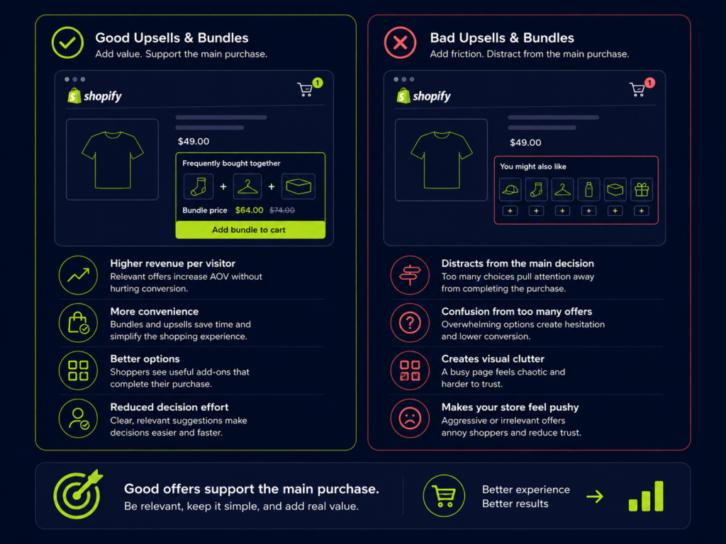
Done well, upsells and bundles can:
- Increase revenue per visitor – The same traffic produces more revenue because more customers buy slightly more (or slightly better) than the base product.
- Improve convenience – Shoppers don’t have to hunt for the right add-ons or accessories. The store does the thinking for them.
- Present better options, not just more items – Upsells can guide buyers toward the product that actually fits their use case, not just the most expensive SKU.
- Reduce decision effort – Smart bundles compress multiple decisions into one: “This is everything I need” instead of “Which of these 12 add-ons should I pick?”
Done badly, the same tactics can:
- Pull attention away from the main product decision
- Confuse customers with overlapping or contradictory offers
- Create visual clutter that slows people down
- Make the store feel pushy or purely sales-driven
Your goal is not “more upsells.” Your goal is better offers that support the main purchase.
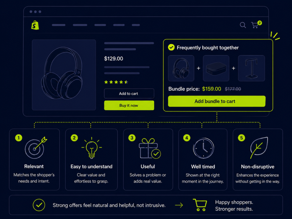
What Makes an Upsell or Bundle Actually Work
Before you pick placements or app features, it helps to think about upsells and bundles as offer design, not as UI widgets.
A strong upsell or bundle usually feels:
- Relevant – Clearly connected to what the shopper is trying to do or solve
- Easy to understand – The value and difference vs. the base option are obvious in a few seconds
- Useful to the shopper – It makes the product easier to use, more complete, or better suited to their context
- Well timed – It appears when the shopper has enough information (and intent) to consider it
- Non-disruptive – It supports momentum instead of hijacking the flow with modals, overlays, or hard-to-close popups
The more an offer feels like it naturally belongs with the main purchase, the more likely it is to increase order value without hurting conversion.
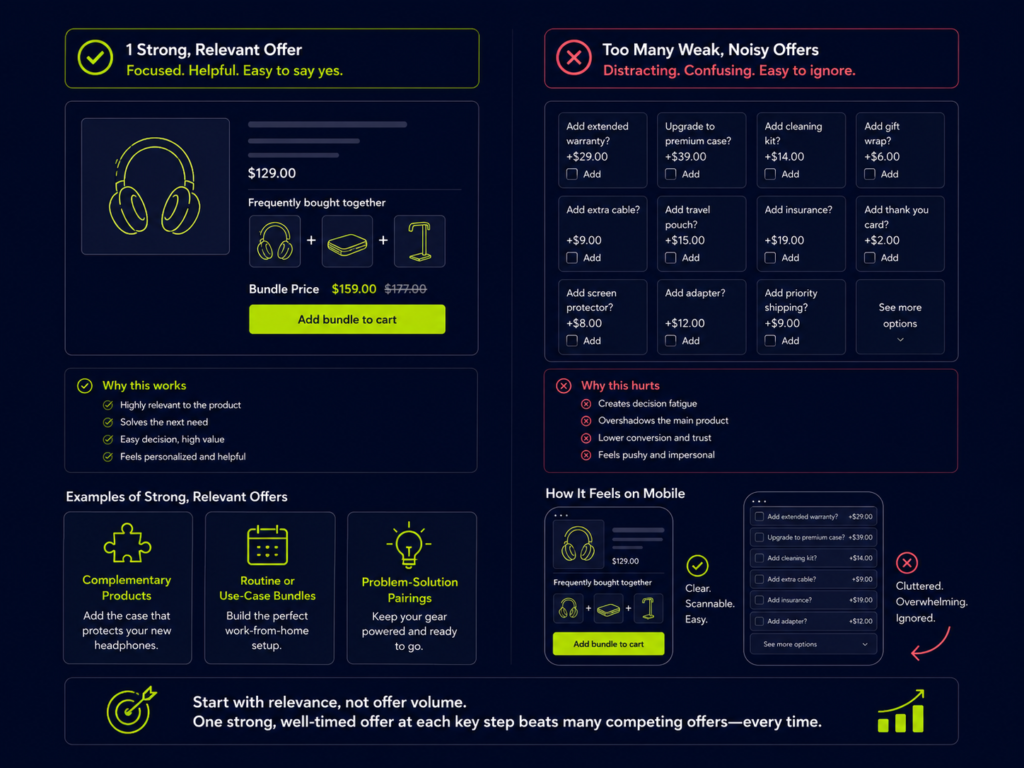
Start with Relevance, Not Offer Volume
One of the biggest mistakes in Shopify upsell strategy is assuming that more offers equals more revenue.
In reality, a single relevant recommendation often outperforms three or four weak ones.
Complementary products
These are add-ons that clearly support the main product:
- Protective case for a device
- Cleaning kit for a pair of shoes
- Brush or mitt for a cosmetic product
- Extra charger or cable for electronics
The logic is simple to the shopper: “If I’m buying this, it makes sense to also get that.”
Routine or use-case bundles
Here, the bundle matches a specific routine or job-to-be-done:
- Skincare routine (cleanser + toner + moisturizer)
- New pet kit (bowls + leash + starter food)
- Coffee ritual (beans + grinder + filters)
The shopper sees a complete solution rather than a loose collection of items.
Problem–solution pairings
Think about the underlying problem, not just the product category:
- “Dry skin in winter” → bundle of richer moisturizer + overnight mask
- “Travel-friendly grooming” → bundle of mini sizes + travel case
- “Home office comfort” → chair + footrest + lumbar support
If the problem is clear, the bundle feels like an obvious answer.
Why too many offers create friction
When every page section contains a different upsell block, the shopping experience quickly becomes noisy:
- Shoppers can’t tell which offer is most important
- They hesitate because they’re afraid of missing a better deal elsewhere on the page
- Mobile users get “scroll fatigue” trying to process everything
A better rule: one strong, clearly relevant offer per key step in the journey is almost always better than three competing ones.
Use Bundles to Make the Buying Decision Easier
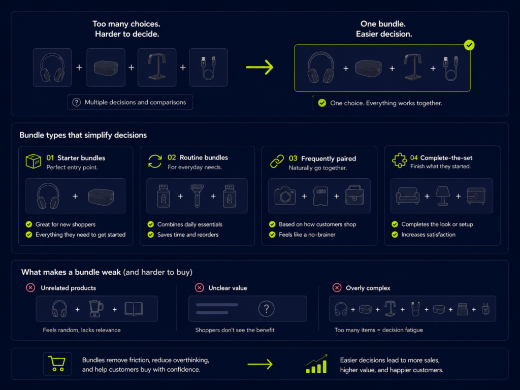
Bundles are not just a way to push higher ticket totals. They are a decision-support tool.
Good bundles reduce complexity by grouping the right products together in a way that makes the value obvious.
Starter bundles
Starter bundles are perfect for new customers who don’t yet know what they need.
Examples:
- “Beginner barista kit” with the essential tools
- “Starter skincare set” for a skin type or concern
- “First-time dog owner kit” with basics in one click
The benefit: one choice instead of five.
Routine bundles
Routine bundles fit into repeatable behaviors:
- “Monthly refills” for coffee pods, supplements, or razor blades
- “Morning routine” or “evening routine” sets
- “Weekly cleaning kit” for household products
These work well because they match how customers naturally use the products.
Frequently paired products
Sometimes the data is already there. Look at:
- Products often purchased together in the same order
- Add-ons commonly added after a specific item
Use this to build bundles that feel “obvious” rather than invented.
Complete-the-set bundles
For certain categories, the most compelling bundle is simply “everything you need to feel done”:
- Outfit with top + bottoms + accessory
- Gaming console + second controller + popular game
- Notebook + pen set + storage pouch
When bundle logic feels forced
Red flags that your bundle logic is working against you:
- The products solve unrelated problems
- The only hook is “Save 10%” with no real narrative
- The shopper still has to add missing essentials separately
- It’s not clear why these specific SKUs are grouped
If the bundle needs a long explanation to make sense, it probably won’t convert well.
For a broader strategy around AOV, see your content on how to increase average order value on Shopify once that article is live—this piece is designed to sit directly underneath it as the upsell and bundle deep dive.
Use Upsells to Improve Fit, Not Just Basket Size
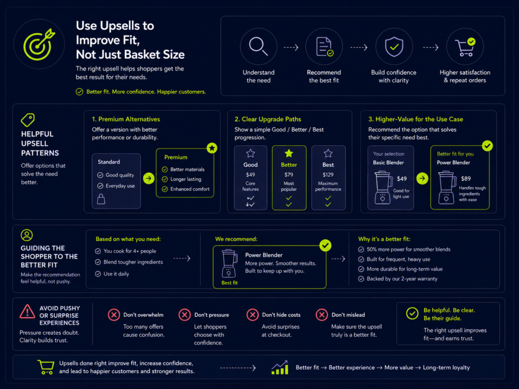
Not every upsell should be “buy more.” Some of the best upsells are about better fit:
- A size that covers the real use case
- A material that lasts longer
- A format that matches how the product is actually used
Premium alternatives
Premium alternatives work when the extra cost clearly maps to extra value:
- Longer-lasting product (e.g., higher-quality fabric)
- Better experience (e.g., upgraded sound quality)
- More flexibility (e.g., travel-sized set plus full-size refills)
The comparison should be easy to scan: what you get, what you pay, and why it’s worth it.
Upgrade paths
Clear upgrade paths help shoppers self-select into the right tier:
- “Good / Better / Best” layouts with honest trade-offs
- Tiered bundles (basic, plus, complete)
- Subscription vs. one-time purchase comparisons
The key is to explain who each option is for, not just how much more it costs.
Higher-value versions
Sometimes the best upsell is simply the version that fits the real job:
- Larger size for heavy users
- Multi-pack for households
- Variant that solves an additional problem (e.g., sensitive skin formula)
When upsells feel too pushy
Upsells cross the line when they:
- Replace the shopper’s choice instead of improving it
- Feel like a surprise cost increase right at checkout
- Use scarcity or pressure tactics that don’t match your brand
A good test: would a thoughtful sales associate make this suggestion in person? If not, rethink the offer.
The Best Places to Show Upsells and Bundles
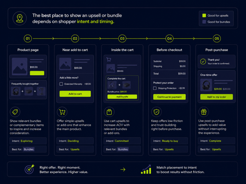
Placement is just as important as offer design. A good offer in the wrong place will still underperform.
Different placements support different intentions:
- Product page: education and consideration
- Add-to-cart moment: nudging toward a more complete choice
- Cart: reinforcing and lightly extending the decision
- Post-purchase: capturing additional intent without risking the main sale
On the product page
The product page is where shoppers are still deciding whether to buy.
Good offers here:
- Help them understand how to get the most out of the product
- Show logical add-ons or bundles that match the main item
- Stay clearly secondary to the primary “Add to cart” action
Near add to cart
The small area around the “Add to cart” button can host:
- “Complete your routine” suggestions
- A clearly framed “Upgrade to bundle” option
- A simple toggle or radio button for a better-fit version
Keep it visually tight so the main action stays obvious.
Inside the cart
Cart upsells and bundle prompts are about finishing touches, not big new decisions.
Examples:
- Small add-ons (“Add a travel case for 9 USD”) that are easy to accept or ignore
- Threshold prompts (“Spend 12 USD more for free shipping”) that suggest a relevant item
- Cross-sells that genuinely support what’s already in the cart
Before checkout
Pre-checkout modals are risky. They can work when:
- The offer is extremely simple and clearly helpful
- The shopper can dismiss it quickly without losing context
Use sparingly and always monitor the impact on checkout starts and completion rate.
After purchase or post-purchase
Post-purchase upsells are a good place for:
- Refills or add-ons that don’t require rethinking the whole order
- Memberships or warranties where the customer has just committed to the product
Even here, relevance and simplicity are critical.
For deeper guidance on product page and cart UX, see your planned guides on Shopify product page optimization and Shopify cart and checkout optimization.
Product Page Upsells and Bundles
On product pages, upsells and bundles should support decision-making—not compete with it.
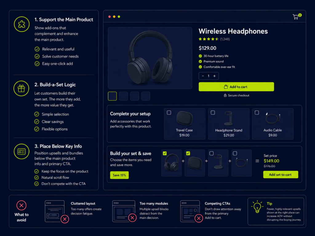
Add-ons that support the main product
Focus on items that:
- Remove friction from using or setting up the product
- Extend the lifespan or performance
- Help the buyer get to “ready to use” faster
Build-a-set logic
For categories like fashion, beauty, or home, consider “build-a-set” flows:
- Choose main item → pick coordinated add-ons → see a combined price
- Pre-built sets that still allow small customizations
Make sure the shopper always understands which item is the primary purchase.
Bundle placement without clutter
A few implementation tips:
- Keep bundles just below the core product details, not sandwiched between critical information
- Use clear headings like “Complete the set” or “Best value bundle”
- Show pricing and savings clearly in one line
Avoiding PDP distraction
Signs that your product page bundles are hurting more than helping:
- Scroll depth to the main call-to-action drops after you add bundle blocks
- Users spend more time on the page but add to cart less often
- Mobile layouts feel cramped or require too much horizontal scrolling
When in doubt, prioritize clarity of the main product decision first.
Cart Upsells and Bundle Prompts
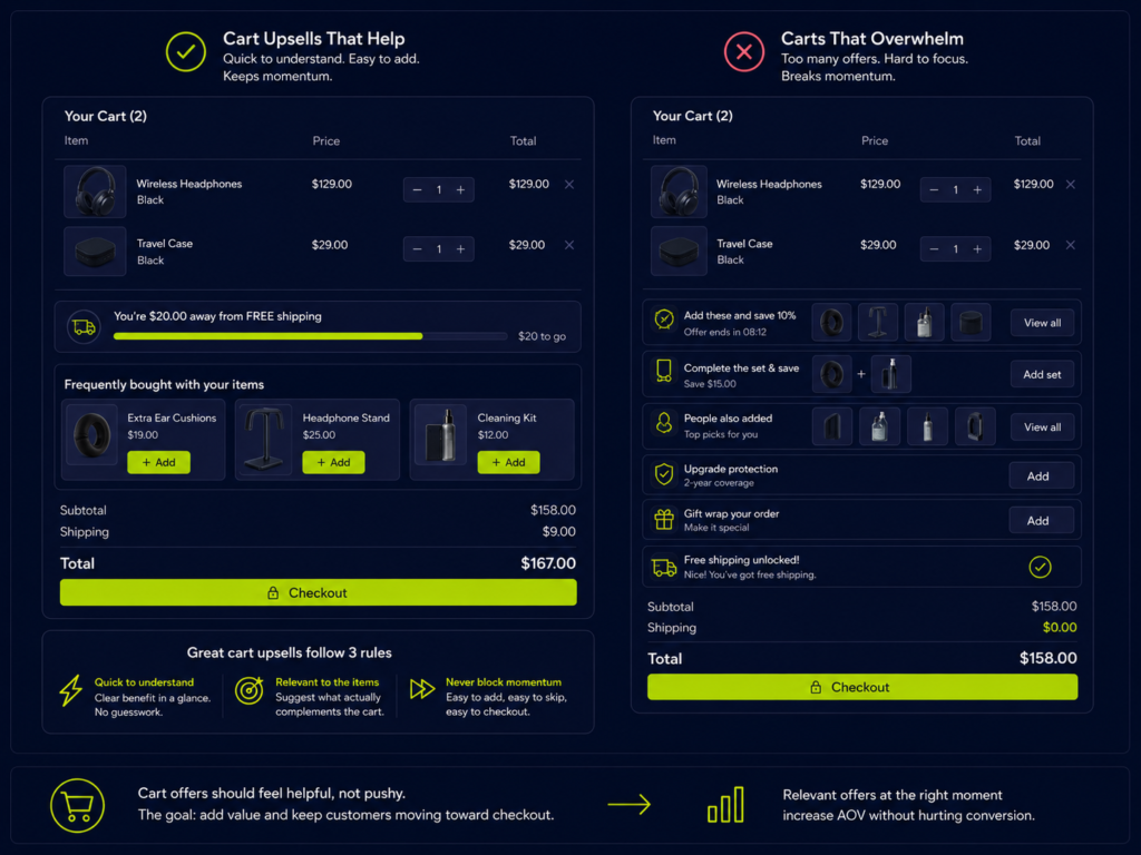
The cart is a late-stage environment where momentum matters.
Good cart offers:
- Are visually lighter than the main cart items
- Can be understood and acted on in seconds
- Don’t require complex reconfiguration of the order
Small add-ons in the cart
Examples:
- Low-cost accessory that genuinely improves the purchase
- Gift wrapping
- Refill or backup item for something that runs out
These work best when they feel like “quick wins,” not major decisions.
Threshold-driven prompts
Thresholds (e.g., free shipping or bonus gift) can work when:
- The gap to the threshold is small
- Suggested items match what’s already in the cart
- The benefit is clear and specific
Cross-sells that support the purchase
Cart is a good place for:
- Maintenance or care products
- Refills or complementary items for what’s already chosen
Avoid unrelated cross-sells that feel like generic catalog pushes.
When cart offers become distracting
Warning signs:
- Cart abandonment rate rises after implementing new cart widgets
- Customers complain that it’s hard to see their final total
- Mobile cart feels like a long scrolling page of “maybe” items
If the cart feels crowded, simplify first and then reintroduce only the highest-value offers.
Bundle Messaging and Savings Communication
Even a smart bundle can underperform if the messaging is unclear.
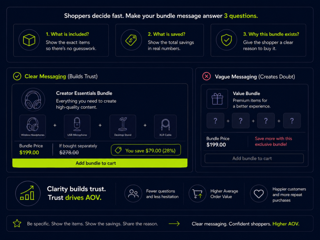
The shopper should be able to answer three questions quickly:
- What is included?
- Why does it help?
- What do I gain by choosing it? (savings, convenience, better result)
What is included
Use plain language and avoid internal product codes:
- “Cleanser + toner + moisturizer for dry skin” is clearer than “Bundle #3 – Winter Kit.”
- Use icons or small thumbnails to visually reinforce what’s inside.
What is saved
Make savings obvious, not something the user has to calculate:
- “Buy together and save 14 USD”
- “18% less than buying separately”
Avoid vague phrasing like “great value” without numbers.
Why this bundle exists
Explain the logic behind the bundle:
- “Everything you need to get started with…”
- “Built for customers who…”
Why unclear offers underperform
When the value isn’t obvious:
- Shoppers default to the safer option of buying one item only
- They wonder if the bundle is hiding a bad deal
- They feel they need to slow down and compare line by line
Clarity builds trust—and trust is what allows AOV to grow without a conversion penalty.
Why Many Shopify Upsells and Bundles Fail
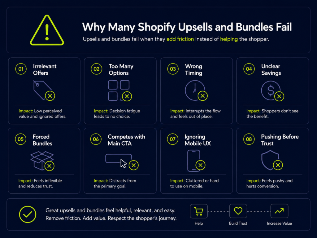
A lot of Shopify stores technically have upsell and bundle functionality, but it’s not helping the numbers.
Common failure patterns:
- Irrelevant offers – Promoting products that have nothing to do with the current purchase
- Too many options – Three different widgets all fighting for attention
- Wrong timing – Big, complex offers shown right when the user wants to pay and leave
- Unclear savings – “Save more” messaging with no concrete explanation
- Forced bundles – Groups of products that don’t match a real-life use case
- Competition with the main CTA – Upsell buttons that look more prominent than “Checkout”
- Ignoring mobile UX – Desktop-heavy layouts simply squeezed onto small screens
- Pushing before trust – Aggressive offers before the shopper has enough confidence in the brand
Most of these issues come from treating upsells and bundles as a switch you turn on, rather than a piece of your broader conversion optimization services work.
Mobile UX for Upsells and Bundles
What looks neat on desktop can easily overwhelm a mobile shopper.
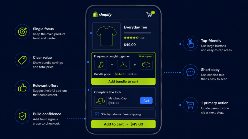
Key principles for mobile upsell and bundle UX:
- Strong visual hierarchy – One primary action per screen. Secondary offers should be visually lighter.
- Scannable layouts – Short headings, clear pricing, and minimal text blocks.
- Reasonable number of blocks – A long stack of upsell sections will tire users out.
- Tap-friendly controls – Buttons and toggles should be large and easy to tap without zooming.
If a mobile user needs multiple swipes just to get past your offers, you’re likely trading conversions for theoretical AOV.
When planning broader mobile improvements, consider how offer blocks fit into your overall Shopify design services or future mobile UX roadmap.
A Simple Upsell and Bundle Checklist for Shopify Stores
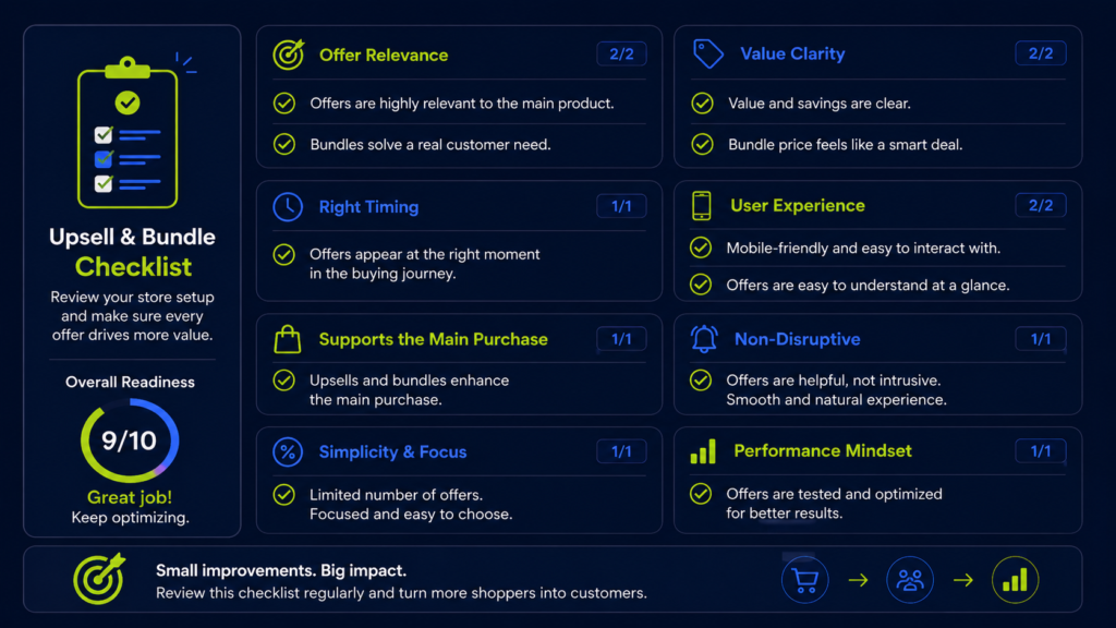
Use this checklist to quickly review existing upsells and bundles on your store:
- Are the offers relevant to the main product or use case?
- Is the value of the upsell or bundle obvious within a few seconds?
- Does the offer reduce effort (fewer decisions) or add complexity?
- Is the timing right for the stage of the journey (product page vs. cart vs. post-purchase)?
- Is the offer easy to understand on mobile?
- Are savings or advantages explained with real numbers?
- Does the offer support the main purchase instead of distracting from it?
- Is the number of upsell prompts per step reasonable?
- Are the offers improving AOV without weakening momentum (check add-to-cart and checkout data)?
- Would a typical shopper see the offer as useful or pushy?
For a more systematic review, you can integrate upsell and bundle checks into a broader Shopify CRO audit or Shopify CRO audit checklist once those resources are live.
How to Prioritize Which Offers to Test First
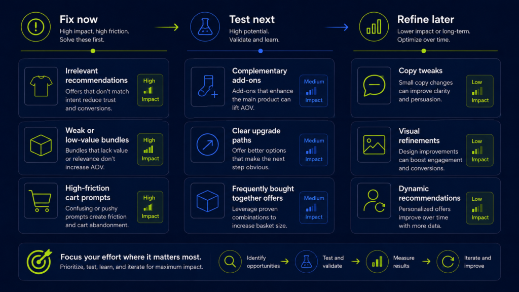
Not every upsell or bundle idea deserves equal attention. Treat this like any other CRO roadmap.
Fix now
Offers that are clearly weak or confusing:
- Irrelevant recommendations
- Bundles nobody clicks or buys
- Cart prompts that correlate with higher abandonment
These are candidates for removal or major redesign.
Test next
Promising ideas that align strongly with shopper logic:
- Complementary add-ons with clear value
- Well-framed upgrade paths
- Bundles based on real “frequently bought together” data
These should enter your testing pipeline early.
Refine later
Enhancements that can improve performance but are not urgent:
- Visual refinements and copy tweaks on already-strong offers
- Additional bundles for niche segments
- More sophisticated logic (e.g., dynamic recommendations) once the basics work
When you build a testing roadmap, group upsell and bundle ideas alongside other AOV tactics so you can see trade-offs and dependencies.
Final Thoughts – Better Offers Should Feel Helpful
Upsells and bundles work best when they help shoppers make a better buying decision—not just a bigger one.
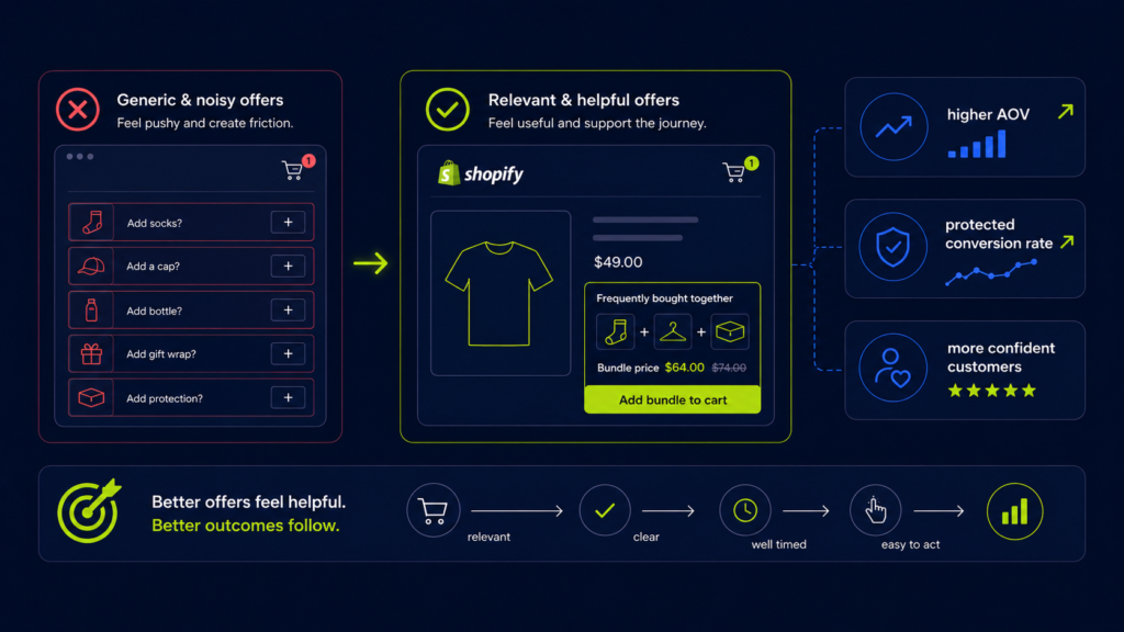
When offers are relevant, clear, well timed, and easy to act on, they can:
- Increase AOV
- Protect (or even improve) conversion rate
- Leave customers feeling more confident about what they bought
If your current setup relies on generic widgets and “more offers everywhere,” there is likely meaningful upside in simplifying, re-framing, and re-prioritizing.
Need help improving upsells, bundles, and AOV without hurting conversion?
A specialized Shopify CRO agency can help you:
- Identify the highest-impact upsell and bundle opportunities
- Design offer logic that feels helpful, not pushy
- Integrate offers into product pages, carts, and mobile UX without adding friction
- Build a testing roadmap that connects AOV gains to overall revenue performance