
Shopify CRO Audit Checklist
Use this Shopify CRO audit checklist to review every critical area of your store, from traffic relevance and product pages to cart, checkout, mobile UX, trust signals, AOV drivers, and analytics.
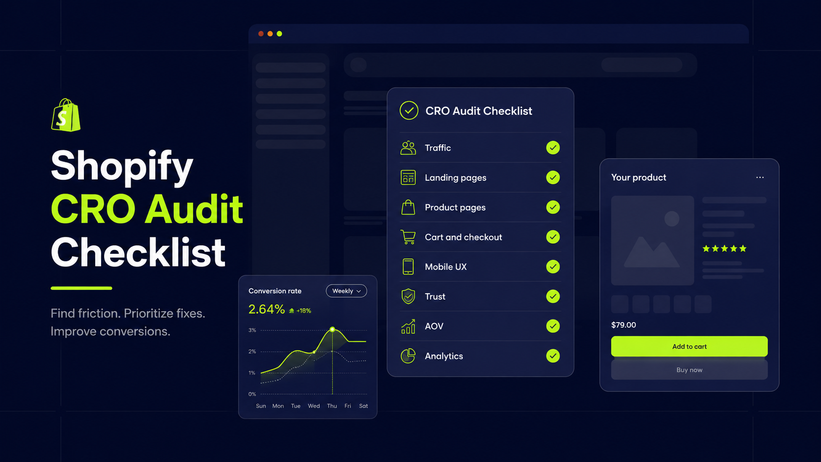
This Shopify CRO audit checklist gives you a structured way to review your store from first impression to completed order. Instead of guessing, you’ll systematically check traffic relevance, product discovery, product pages, cart and checkout, mobile UX, trust signals, average order value (AOV) drivers, and analytics.
Use it when you’re:
- Seeing plenty of traffic but inconsistent conversion
- Planning a redesign and want to avoid rebuilding the same problems
- Preparing a testing roadmap and need a prioritized list of issues and opportunities
If you want a deeper, process-level walkthrough of how to structure an audit and turn it into a roadmap, pair this with your future “how to run a Shopify CRO audit” guide. This checklist focuses on the practical side: what to review so that your decisions are grounded in evidence, not hunches.
How to Use This Shopify CRO Audit Checklist
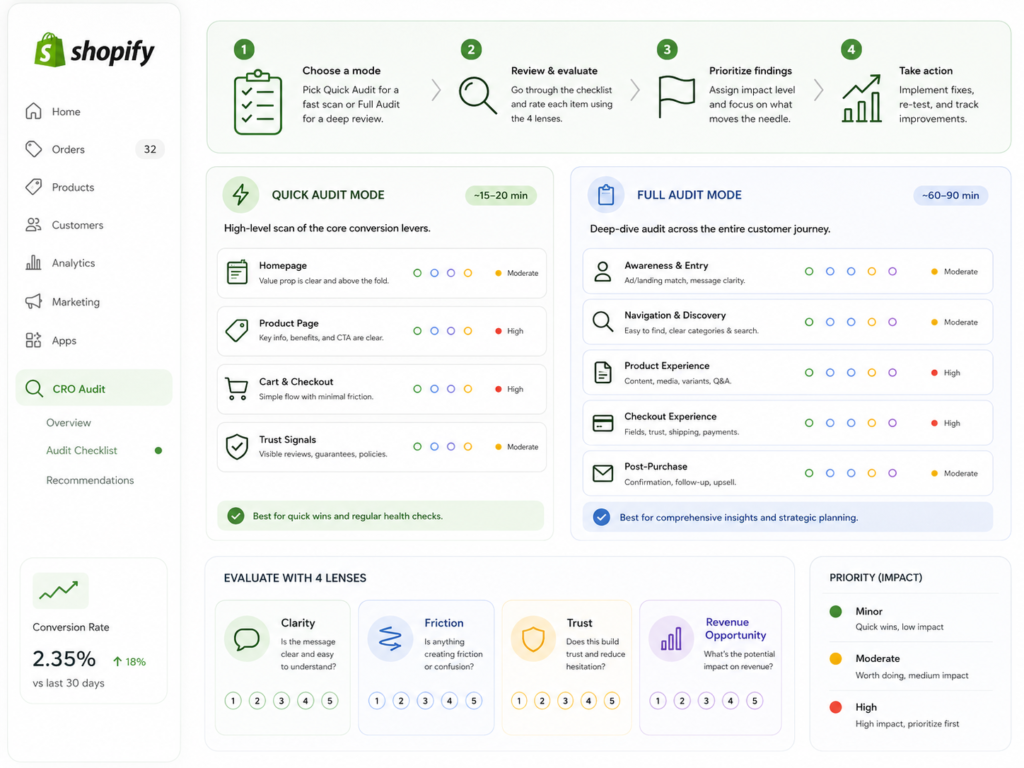
This checklist is designed to be practical, not theoretical. You can use it in two modes:
Quick audit mode (60–90 minutes)
If you need a fast diagnostic before a campaign or design decision, focus on:
- Traffic and landing page relevance
- Product pages
- Collections
- Cart and checkout
- Mobile CTA visibility
- Core trust signals
You won’t catch everything, but you’ll uncover the most obvious blockers before you commit more spend or dev work.
Full audit mode (half-day to multi-day)
When you’re planning a serious optimization push, work through:
- All checklist sections in this article
- Both desktop and mobile experiences
- Key traffic sources (paid social, paid search, email, organic, etc.)
Document your findings as you go so you can prioritize later instead of relying on memory.
Review each item through four lenses
For every section, look at each point through these four lenses:
- Clarity – Is it immediately obvious what’s happening, what the offer is, and what the next step should be?
- Friction – Is anything slowing the user down, confusing them, or forcing unnecessary effort?
- Trust – Does the experience feel credible, safe, and low-risk for a first-time buyer?
- Revenue opportunity – Could this area be used more effectively to increase conversion or AOV?
Don’t treat every issue equally. After each section, mark overall severity as:
- Minor issue – Not ideal, but unlikely to materially move conversion.
- Moderate issue – Noticeable friction or missed opportunity worth addressing soon.
- High-impact issue – Clear blocker or gap that is likely affecting revenue right now.
Shopify CRO Audit Checklist for Traffic and Landing Page Relevance
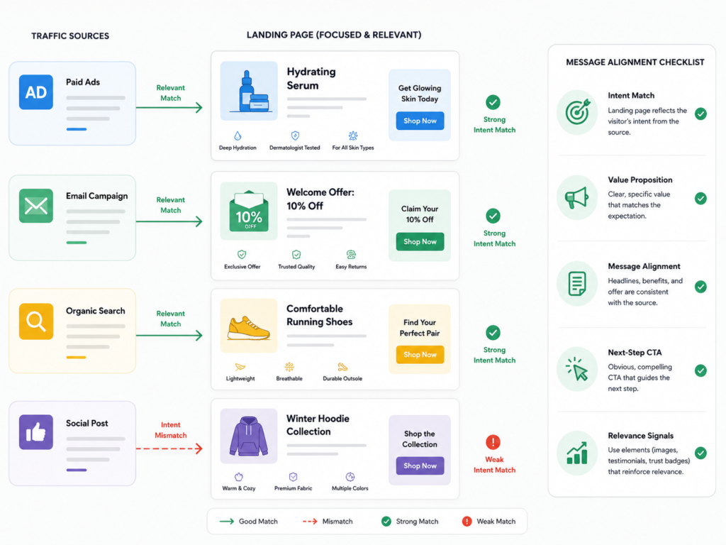
A lot of “on-site UX problems” start as traffic-to-page mismatch. If people arrive on the wrong page or see a message that doesn’t match the promise of the ad or search result, even the best-designed PDP won’t save you.
Checklist:
- Are paid traffic visitors landing on the most relevant page? High-intent searches and bottom-funnel ads should land on focused PDPs or highly relevant collections, not the homepage by default.
- Does the landing page match the promise of the ad, email, or search intent? Copy, imagery, and offer should echo the hook that got the click.
- Is the value proposition clear within the first screen? Within a few seconds, users should understand what you sell, who it’s for, and why it’s different.
- Is the page aligned with the traffic source and buyer awareness level? Cold social traffic often needs more context and education than branded search or remarketing.
- Is the next step obvious and appropriate for the visitor? Clear CTAs that guide users toward the right category, PDP, or offer based on their intent.
Why this matters?
Weak traffic and landing page relevance can cap your conversion rate before product pages even get a chance to do their job. Fixing this alignment often improves revenue faster than tweaking button colors.
Severity prompt: Label this section overall as Minor, Moderate, or High-impact based on how closely traffic, message, and landing experience align.
Shopify Product Page Audit Checklist
Product pages are where intent turns into action. Small issues here compound quickly across your store.
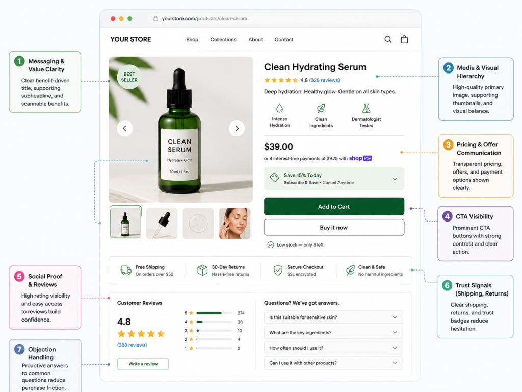
Messaging and Value Clarity
- Is the core product benefit clear above the fold? Users should see in one glance what the product helps them achieve or avoid, not just what it is.
- Is it obvious who the product is for (and who it’s not for)? Audience clarity improves relevance and reduces returns.
- Is the copy focused on outcomes, not just features? Translate features into benefits that matter to your target customers.
- Are the most important questions answered early enough? Size/fit, ingredients/materials, how it works, compatibility, and use cases should be easy to find without scrolling endlessly.
Media and Visual Hierarchy
- Are product images strong enough to build confidence? Include multiple angles, lifestyle shots, zoom, and detail where it matters.
- Does the layout visually guide users toward key actions? Hierarchy should emphasize product title, price, benefits, social proof, and add-to-cart.
- Is critical information easy to scan? Use bullets, bold labels, and short paragraphs instead of dense blocks of copy.
Offer and Pricing Communication
- Is pricing clear and easy to understand? Avoid hidden fees and confusing comparisons.
- Are discounts, bundles, and savings communicated clearly? Make it obvious why a bundle, subscription, or higher-quantity option is better value.
- Are shipping, delivery, and duties expectations easy to find? Surprises here often kill conversion later in the funnel.
CTA and Interaction
- Is the add-to-cart CTA visible without effort on both desktop and mobile? Users shouldn’t have to scroll or hunt for the primary action.
- Is variant selection (size, color, options) intuitive and validated? Clear states, helpful error messages, and no dead ends.
- Are there any UX interruptions before add to cart? Pop-ups, forced account creation, or unclear errors introduce unnecessary friction.
Trust and Objection Handling
- Are reviews and ratings visible at the right time? Ideally near the decision area, not buried at the bottom.
- Are returns, shipping, and guarantees explained in plain language? Reduce perceived risk for first-time buyers.
- Are common objections addressed proactively? For example, durability, fit, ingredients, or installation concerns.
Why this matters
Many Shopify stores generate plenty of product page views but low add‑to‑cart rates. That’s usually a signal of unclear value, missing information, or friction around the CTA and trust signals—not a traffic problem.
Severity prompt: Label product page issues overall as Minor, Moderate, or High-impact based on how much they could affect add‑to‑cart rate.
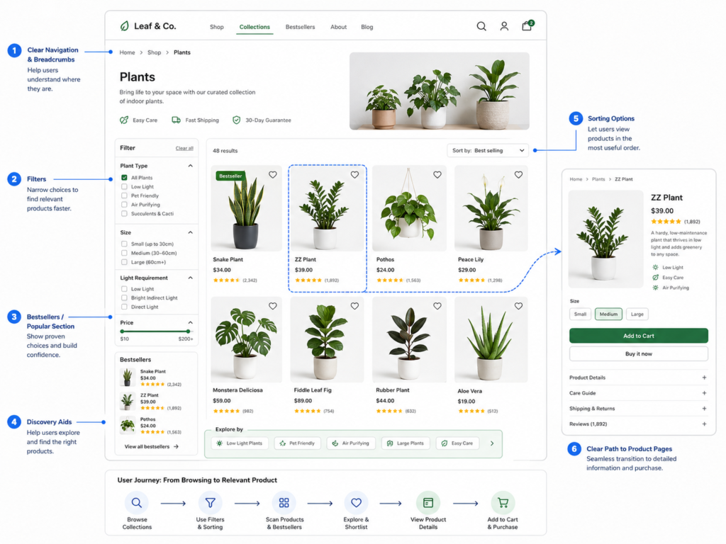
Shopify Collection and Category Page Checklist
If collection and category pages don’t help users find the right products quickly, they may never see the PDPs you’ve optimized.
Checklist
- Are filters and sorting options useful and easy to use? Include filters that match how customers actually shop (use cases, size, style, problem, etc.), not just what’s easy to configure.
- Can users quickly understand the difference between products? Product titles, thumbnails, and key attributes should give enough context to choose what to click.
- Are product cards informative enough to support confident clicks? Consider showing price, key benefits, bestsellers, badges, and key differentiators.
- Are bestsellers, hero products, or key categories surfaced clearly? Don’t hide your highest-converting products.
- Does navigation guide users toward the right product paths? Menus, breadcrumbs, and on-page navigation should reduce decision fatigue, not add to it.
Why this matters
Weak product discovery means your best offers never get a fair chance. Improving collections can raise conversion before you change anything on individual PDPs.
Severity prompt: Label this section overall as Minor, Moderate, or High-impact based on how efficiently users can move from browsing to relevant PDPs.
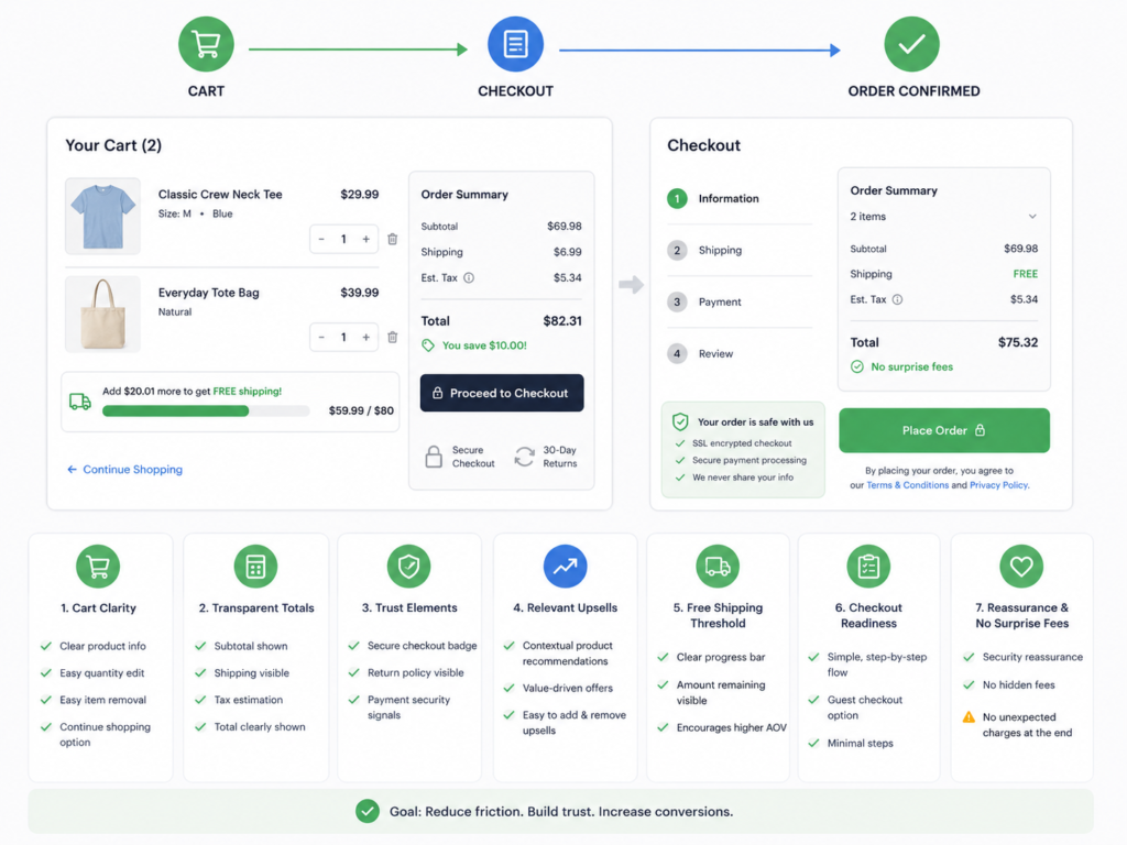
Shopify Cart and Checkout Checklist
This is where revenue is most fragile. Small UX or trust issues here create disproportionately large drops in conversion.
Cart Clarity
- Is it easy to review what was added? Clear product names, variants, quantities, and thumbnails.
- Are pricing and totals transparent? Subtotals, discounts, shipping estimates, and taxes should be visible and understandable.
- Are trust elements visible before checkout? Badges, returns info, and support options should be easy to spot.
AOV and Offer Logic
- Are upsells and cross-sells relevant and well placed? Avoid generic “you may also like”; focus on genuinely complementary products.
- Are threshold incentives communicated clearly? Free shipping or discount thresholds should show progress and feel achievable.
- Are any bundles or upgrades framed as obvious wins? Make it clear when a bundle is better value than buying items separately.
Checkout Readiness
- Are unexpected costs introduced too late? Shipping or fees appearing only at the last step increase abandonment.
- Is there any hesitation point before paying? Long forms, mandatory account creation, or confusing steps add friction.
- Are reassurance signals visible at the final decision stage? Security badges, payment methods, and support options can calm last‑minute doubts.
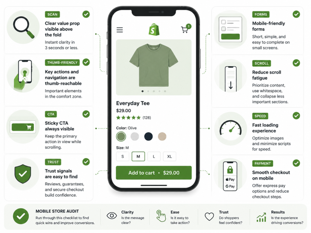
Mobile UX Checklist for Shopify CRO
For many Shopify brands, mobile is the primary traffic and revenue channel—yet it often gets a lighter review. When we provice Shopify design services we aalways start with the mobile version. Because ~70% users buy using mobile phones
Checklist
- Is every key page easy to scan on a small screen? Short paragraphs, clear headings, and sufficient spacing.
- Are key actions reachable without frustration? Add-to-cart, filters, and important controls should be thumb-friendly.
- Is CTA visibility strong throughout the journey? Floating or sticky CTAs can help, as long as they don’t block critical content.
- Is important information buried under too many accordions? Hiding everything behind taps can increase effort and reduce comprehension.
- Does the layout reduce scroll fatigue or increase it? Avoid unnecessary whitespace and repetitive blocks on long PDPs.
- Are forms, selectors, and interactions mobile-friendly? Keyboards, inputs, and selectors should be tailored to the data being entered.
Why this matters
A store that feels smooth on desktop but clumsy on mobile is leaving money on the table. Mobile UX issues compound with smaller screens, slower connections, and shorter attention spans.
Severity prompt: Label this section overall as Minor, Moderate, or High-impact based on mobile conversion versus desktop and your qualitative review.
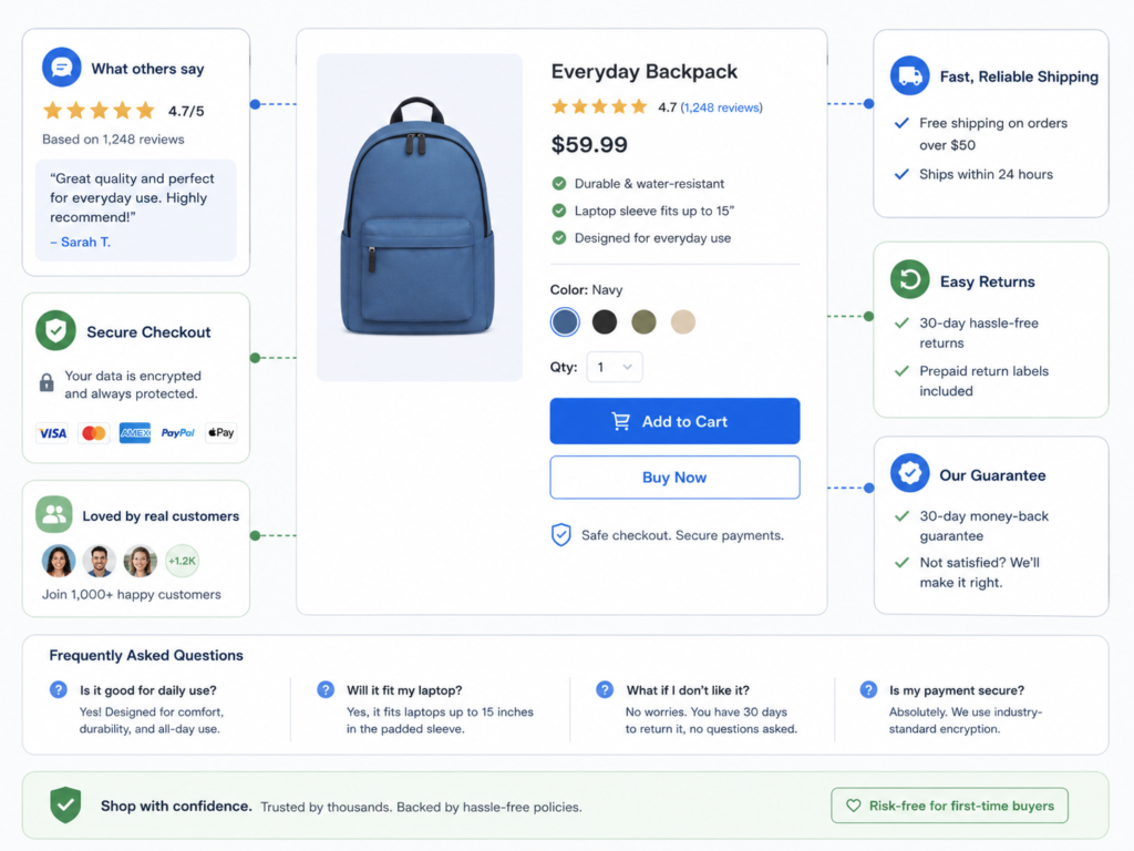
Trust and Objection Handling Checklist
Many conversion problems are actually clarity and trust problems. People hesitate when they don’t feel safe, informed, or understood.
Checklist
- Are reviews visible before the purchase decision? Users shouldn’t have to scroll to the bottom or open a separate tab.
- Is shipping information clear and prominent? Delivery timing, costs, and regions should be explained in plain language.
- Are returns and refund expectations easy to understand? Avoid vague or legalistic wording.
- Is there enough reassurance for first‑time buyers? Guarantees, social proof, press mentions, and FAQs can reduce perceived risk.
- Do pages answer the objections that usually slow down conversion? Use FAQs, short explainer blocks, or comparison tables to address known concerns.
Why this matters
Even a beautifully designed store will underperform if users are unsure about what happens after they click “Buy.” Reducing uncertainty almost always improves conversion quality and volume.
Severity prompt: Label this section overall as Minor, Moderate, or High-impact based on how confidently a first-time visitor would feel about buying.
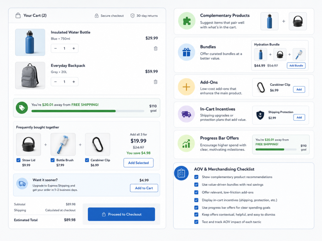
Average Order Value and Merchandising Checklist
CRO isn’t only about conversion rate. It’s also about revenue efficiency—how much value you create per visitor. AOV is a big part of our CRO service becuase this helps Shopify store owners earcn more with the same traffic.
Checklist
- Are complementary products surfaced at the right moments? Think “complete the look,” “frequently bought together,” or logical accessories.
- Are bundles clearly valuable and easy to understand? Show savings explicitly and frame the bundle around a specific use case.
- Are cart incentives encouraging higher order values naturally? Progress bars and tiered offers should feel like a win, not a trick.
- Are add-ons presented at the right time? Post-add-to-cart modals or in-cart prompts often perform better than last‑second checkout interruptions.
- Is merchandising logic helpful or overly aggressive? Too many pop-ups or irrelevant upsells can hurt both conversion and brand perception.
Why this matters
Thoughtful merchandising can lift AOV without feeling pushy. That means more revenue from the same traffic and media spend.
Severity prompt: Label this section overall as Minor, Moderate, or High-impact based on current AOV and how well your upsell logic aligns with customer value.
Analytics and Measurement Checklist
You can’t run a serious Shopify CRO program without reliable measurement. Otherwise, you’re optimizing based on anecdotes.
Checklist
- Are key funnel events measured reliably? Product views, add‑to‑cart, checkout steps, and purchases should be tracked end‑to‑end.
- Can you review performance by device type? Desktop vs. mobile vs. tablet breakdowns are critical for diagnosing UX issues.
- Can you segment results by traffic source and campaign? Paid social, paid search, email, and organic often behave very differently.
- Are you tracking the actions that matter most for your business model? Subscriptions, pre-orders, quiz completions, and other micro‑conversions may be important.
- Can you distinguish UX issues from traffic quality issues? Use segmented funnels and benchmarks to avoid misdiagnosing the problem.
- Are decisions based on strong signals, not assumptions? Before changing templates or rolling out tests, check whether the data you rely on is complete and trustworthy.
Why this matters
Without solid analytics, you’ll overreact to noise and miss real patterns. Good measurement turns this checklist from a one‑off exercise into an ongoing optimization system.
Severity prompt: Label this section overall as Minor, Moderate, or High-impact based on tracking coverage and data quality.
How to Prioritize What You Find
After you’ve worked through the checklist, you’ll have a long list of observations. The value comes from turning those notes into a focused plan.
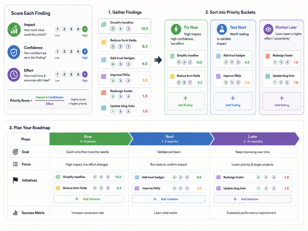
Start by grouping findings into three buckets:
- Fix now – Clear friction or broken experiences that are obviously hurting conversion (e.g., confusing mobile PDP layout, hidden shipping fees, broken filters).
- Test next – Ideas with high potential but worth validating (e.g., new bundle structures, alternative product messaging, different landing page for paid social).
- Monitor later – Useful observations that are not urgent but should be tracked over time.
As you prioritize, consider the potential impact on:
- Add‑to‑cart rate
- Mobile conversion rate
- Average order value (AOV)
- Overall revenue efficiency (revenue per visitor or per session)
Pair this with a simple scoring model (e.g., impact, confidence, effort) to build a testing roadmap rather than a random to‑do list.
Why this matters
A good checklist will reveal dozens of potential improvements. Prioritization protects your team from “CRO thrash” and keeps everyone aligned on the next best move.
Common Mistakes When Using a CRO Checklist
Avoid turning this checklist into another box‑ticking exercise. Some common pitfalls:
- Treating the checklist like a scorecard, not a diagnostic tool. The goal isn’t to “get 10/10” on every section—it’s to uncover friction, trust gaps, and missed opportunities.
- Focusing only on product pages. Traffic relevance, collections, cart, checkout, and mobile UX all influence whether PDP improvements ever get a chance to work.
- Ignoring mobile. Many brands still design for desktop and “shrink it down.” Your audit should treat mobile as a first‑class experience.
- Checking elements without considering traffic intent. The same layout may work for branded search and fail for cold social traffic. Always ask: “For this visitor, at this stage, does this page make sense?”
- Overvaluing visual polish, undervaluing clarity. Clean aesthetics are great, but they can’t replace clear value propositions, obvious next steps, and strong trust signals.
- Failing to prioritize findings. If everything is “important,” nothing moves. Use the prioritization approach above.
- Skipping analytics review. Changes without measurement quickly become guesswork.
Why this matters
Most CRO issues are not hidden. They’re just not reviewed systematically. A disciplined approach to this checklist is what turns “we kind of looked at it” into repeatable growth.
Final Thoughts
A Shopify CRO audit checklist helps you review your store systematically instead of reacting to isolated complaints or “design opinions.” But the real leverage comes from what you do after the audit:
- Fix the obvious friction that’s hurting conversion today
- Design tests for high‑potential ideas
- Align your team around a focused roadmap instead of scattered tasks