How to Run a Shopify CRO Audit
Many Shopify stores don’t have a traffic problem. They have a conversion problem.
You’re already investing in ads, SEO, email, and campaigns—but revenue doesn’t scale in proportion to traffic. Add-to-cart rate feels soft, mobile conversion lags, and every redesign discussion turns into guesswork and opinions.
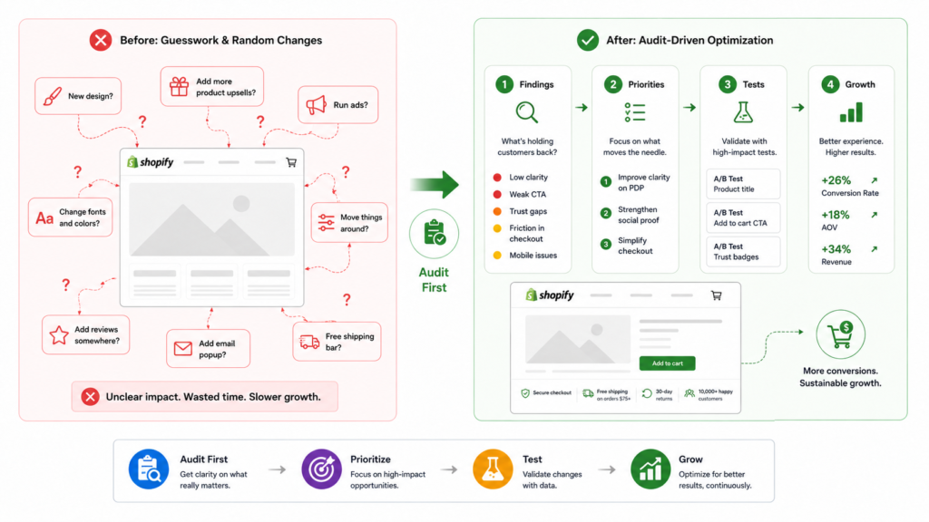
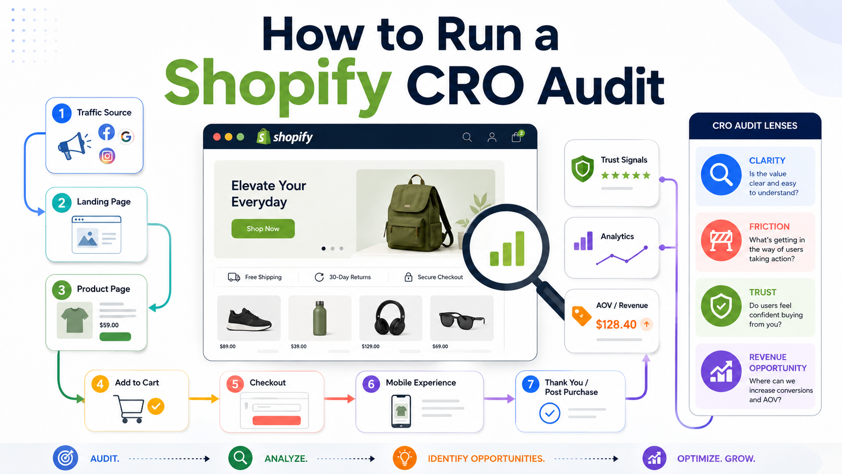
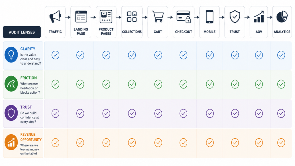
A Shopify CRO audit gives you a structured way to find where the store is leaking revenue and what to fix first. Instead of chasing random tips (“change the button color” or “add urgency everywhere”), you review the full journey—from first touch to checkout—through four lenses:
- Clarity – Do visitors instantly understand what you sell, why it matters, and what to do next?
- Friction – Where does the experience slow people down or make them think too hard?
- Trust – Does the store reduce risk and answer key objections before purchase?
- Revenue opportunity – Where could you ethically increase average order value (AOV) without hurting conversion?
In this guide, we’ll walk through how to run a Shopify CRO audit step by step, so you can:
- Understand what a CRO audit actually is (and what it isn’t)
- Know when it’s the right time to run one
- Follow a practical checklist across traffic, product pages, collections, cart, checkout, mobile UX, trust, AOV, and analytics
- Turn raw findings into a prioritized action plan
If you’d rather have a specialist team run this process with you, explore our Shopify CRO agency services.
What Is a Shopify CRO Audit?
A Shopify CRO audit is a structured review of your store’s buying journey with the goal of improving revenue efficiency—not just making the design look nicer.
It’s not:
- A quick “design roast” focusing only on visuals
- A list of generic tips copied from other blogs
- A one-off piece of UX feedback disconnected from real metrics
Instead, a CRO audit:
- Reviews the full purchase journey, from traffic source to order confirmation
- Identifies friction and missed opportunities that hurt conversion and AOV
- Connects UX issues to business metrics like conversion rate, add-to-cart rate, revenue per session, and AOV
- Produces a prioritized list of changes and tests, not a random wishlist
Think of it as an investigation into why people aren’t buying or buying less than they could.
Compared to a redesign:
- A redesign changes how the store looks and often how it’s built.
- An audit helps you decide whether you even need a redesign, and if you do, which parts must change and why.
Compared to generic UX feedback:
- UX feedback might comment on spacing, fonts, or subjective opinions.
- A CRO audit ties observations back to intent, behavior, and numbers, so every recommendation has a clear “why.”
If you already offer broader conversion optimization services, your Shopify CRO audit is the front door to that work.
When Should You Run a Shopify CRO Audit?
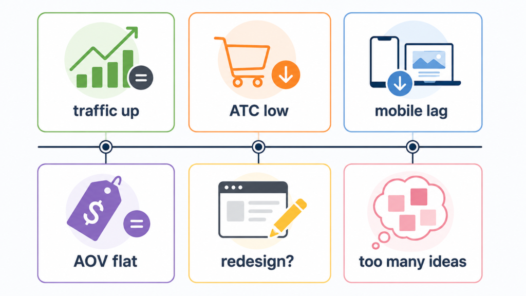
You don’t need a full audit for every tiny issue. But there are clear signals that your store is due for one.
Traffic is growing but sales are not scaling efficiently
- Sessions, clicks, or ad spend are up.
- Revenue is growing slower than traffic, or revenue per session is flat.
- Your cost per acquisition feels uncomfortable, even with “good” traffic.
This usually means the store experience, not traffic volume, is holding you back.
Add-to-cart rate is weaker than expected
- Many users view products, but relatively few add anything to cart.
- PDPs might look polished, but they’re not answering key questions or creating enough conviction.
Here, the audit focuses on product page clarity, offer communication, and perceived risk.
Mobile traffic is strong but mobile conversion lags
- Mobile sessions dominate, but desktop converts better.
- The mobile experience is treated like a shrunk-down desktop version.
This is where a dedicated Shopify mobile UX audit pass becomes critical.
AOV has stopped growing
- Conversion rate looks acceptable, but average order value is flat.
- You’ve tried basic bundles or cross-sells, but they feel random or pushy.
A good audit looks at merchandising, incentives, and where AOV drivers appear in the journey.
You are planning a redesign and want data first
- The team is excited about a new theme or full redesign.
- Nobody can clearly explain what the current store is doing wrong.
Running an audit first prevents you from baking existing conversion problems into a new design.
Your team has too many ideas and no clear priorities
- You have a long list of “fixes” and feature requests.
- Debates are opinion-based, not data-based.
An audit helps you move from “we could change anything” to “here are the 5–10 changes most likely to move revenue.”
What a Good Shopify CRO Audit Should Include
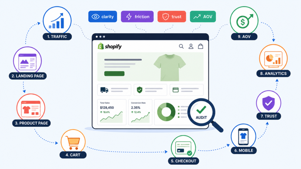
A useful audit looks at the store through the four lenses—clarity, friction, trust, revenue opportunity—across the entire funnel.
At minimum, it should review:
- Store and brand clarity – Can users tell who you are, what you sell, and why you’re different?
- Traffic quality and landing page relevance – Are people landing on the right page for their intent?
- Product pages – Do PDPs create enough conviction to earn the click to cart?
- Collections and category pages – Can shoppers efficiently discover products that fit them?
- Cart and checkout flow – Is anything creating last-minute hesitation or surprise?
- Mobile UX – Is the experience designed for thumbs, small screens, and real mobile behavior?
- Trust and objection handling – Are key doubts resolved before payment?
- Average order value drivers – Are bundles, cross-sells, and incentives used intelligently?
- Analytics and measurement – Can you actually trust the data you’re using to decide?
Treat this section as your audit map. The rest of this guide walks through each part step by step.
Step 1 – Review Traffic Sources and Landing Page Intent
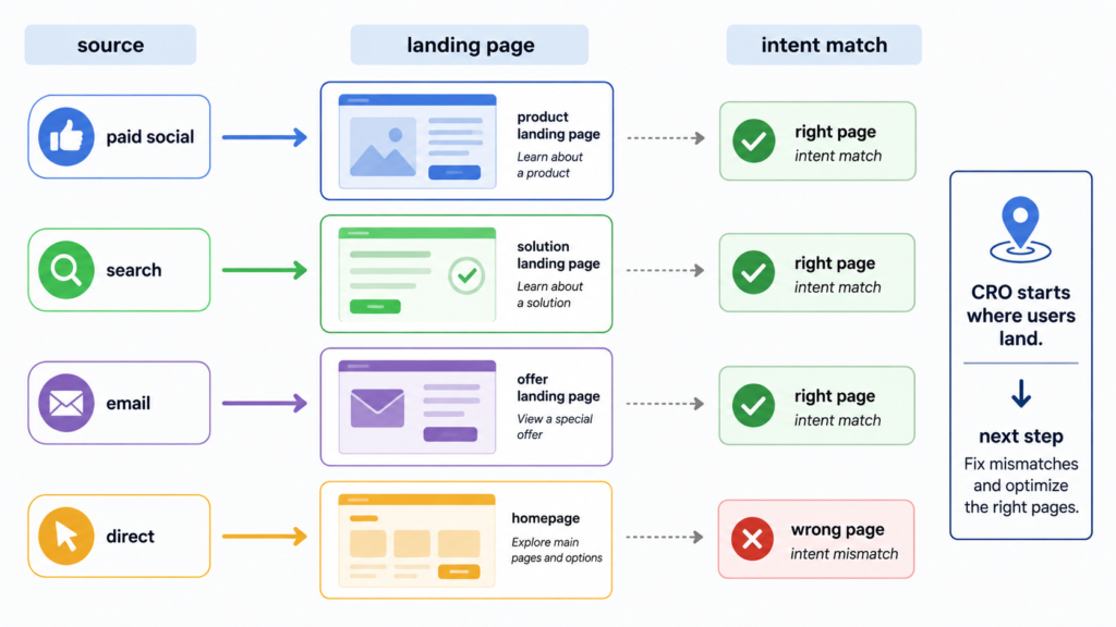
CRO doesn’t start on the product page. It starts where users first land.
What to look for
- Main channels: paid social, paid search, organic search, email, influencers, affiliates.
- Top landing pages per channel.
- Alignment between ad/message promise and landing page content.
- Whether users land on home, collections, PDPs, or custom landing pages for each campaign.
What usually goes wrong
- Ad traffic lands on a generic collection with weak filters and no narrative.
- High-intent search terms land on pages that don’t answer the query (e.g., brand home page instead of a focused category or PDP).
- Email campaigns point to top-level URLs instead of deep links that match the email content.
What to fix first
- Map top campaigns and keywords to purpose-built landing pages with clear value props.
- Make sure each landing page:
- Matches the headline promise made in the ad or snippet.
- Shows a clear next step (browse relevant products, choose a bundle, start a quiz, etc.).
- Loads quickly and looks clean on mobile.
This is also where your broader Shopify optimization checklist work often begins.
Step 2 – Audit Product Pages for Conversion Friction
Product detail pages are where interest turns into intention. Even small issues here can quietly crush add-to-cart rate.
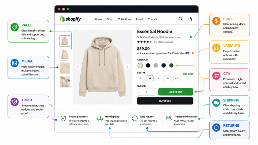
Value proposition and benefit clarity
What to look for
- Does the first screen make it obvious what the product is, who it’s for, and why it’s better?
- Are the main benefits expressed in plain language, not just feature bullets?
What usually goes wrong
- Branded, clever headlines that don’t actually say what the product does.
- Benefits buried under long paragraphs or tabs.
What to fix first
- Add a clear, specific value statement above the fold.
- Turn vague lines into concrete outcomes (“soft and breathable” → “stays breathable even on hot days”).
Product media and visual hierarchy
What to look for
- High-quality images on both desktop and mobile.
- Lifestyle + close-up shots that answer “What does it really look like?”
- Video where it helps clarify use, fit, or motion.
What usually goes wrong
- Beautiful images that ignore practical questions: texture, scale, how it fits on different bodies, what’s included.
- On mobile, key images pushed far below CTAs or hidden in sliders.
What to fix first
- Reorder media so the most informative visuals appear early.
- Add at least one image or video that addresses a common objection (fit, size, complexity, assembly, etc.).
Pricing and offer communication
What to look for
- Clear base price, discounts, and any recurring charges.
- Visibility of shipping thresholds, promotions, and bundles.
What usually goes wrong
- Discounts are mentioned in banners but not surfaced clearly near the price.
- Users discover shipping costs too late, in cart or checkout.
What to fix first
- Put the true total value (price, savings, perks) near the CTA.
- If shipping thresholds or bundles exist, make them visible at the decision point.
Variant selection and usability
What to look for
- Size, color, and variant options that are easy to scan and select.
- Clear feedback when a variant is out of stock.
What usually goes wrong
- Sizes that appear available but error out later.
- Variant labels that are unclear (e.g., “Regular / Tall” without explanation).
What to fix first
- Make unavailable variants visibly disabled.
- Add size guides, fit notes, or simple explainer copy near selection.
CTA clarity and placement
What to look for
- A single, primary “Add to cart” or “Buy now” CTA.
- Consistent position and color.
What usually goes wrong
- Multiple competing CTAs (subscribe, buy now, add to wishlist, etc.) creating decision fatigue.
- CTAs pushed too far below the fold, especially on mobile.
What to fix first
- Prioritize one main action with strong visual weight.
- Ensure CTA is visible without excessive scrolling on most devices.
Trust elements and reassurance
What to look for
- Review count and quality.
- Badges and guarantees that actually mean something.
- Information about shipping, returns, and support.
What usually goes wrong
- Trust signals exist but are placed too low or in generic banners.
- Reviews are present but filtered or formatted in ways that hide useful detail.
What to fix first
- Pull key trust elements above the fold: review stars, review count, clear return policy summary.
- Add microcopy like “Free returns within 30 days” or “Ships in 2–3 business days” near the CTA.
For niche guidance, see how we approach CRO for clothing brands or Shopify CRO for cosmetic brands.
Step 3 – Review Collections and Category Pages
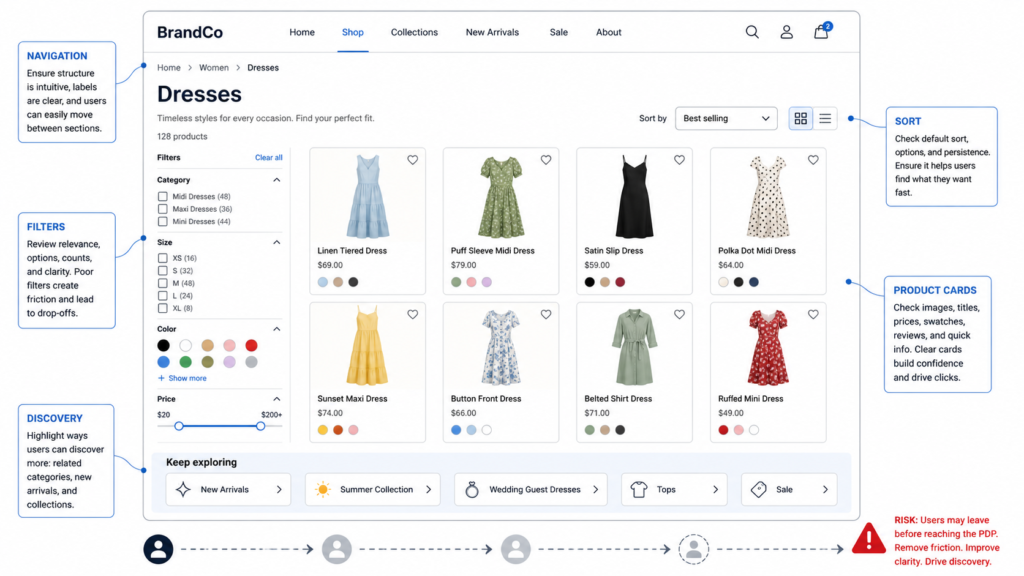
A lot of stores lose customers before they even reach PDPs. Collections are where browsing either feels natural or exhausting.
What to look for
- How quickly a new visitor can narrow down to products that fit their needs.
- Filters and sorting options (by size, color, use case, price, etc.).
- Clarity of product cards (titles, prices, badges, labels).
What usually goes wrong
- Too many products per page without effective filters.
- Filters that exist but are hidden or collapsed on mobile.
- Product cards that don’t highlight key differentiators (best-sellers, bundles, ratings).
What to fix first
- Ensure the most-used filters are visible and easy to access, especially on mobile.
- Simplify sorting options to the ones that actually matter (e.g., “Best selling,” “Price,” “New arrivals”).
- Add clear labels for best-sellers, new items, or key segments.
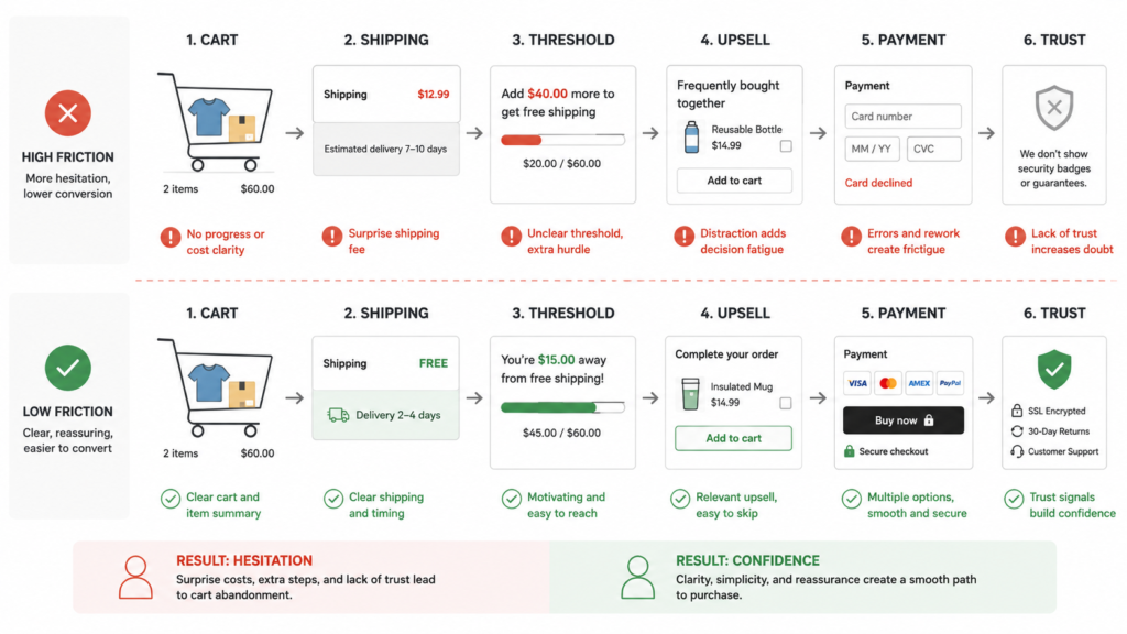
Step 4 – Audit Cart and Checkout Friction
Cart and checkout are where anxiety peaks. Small surprises here cause disproportionate drop-off.
Cart clarity
- Is the cart easy to understand—items, quantities, options, totals?
- Can users update quantities or remove items without confusion?
Shipping and total-cost transparency
- Are shipping costs, taxes, and fees visible early?
- Does the store clearly communicate thresholds (e.g., “Free shipping over $75”)?
Common failure pattern: users only see the true total at the very last step. This creates last-minute friction.
Cross-sells and upsells
- Are cross-sells relevant and helpful, or noisy and random?
- Do they appear in cart, checkout, or both?
Start by avoiding aggressive pop-ups that slow people down. Prefer subtle, context-aware suggestions.
Threshold incentives
- Are thresholds used strategically (free shipping, gifts, discounts)?
- Is progress toward the threshold clearly shown?
Checkout hesitation points
- Are there unnecessary steps, fields, or distractions?
- Are payment options familiar and trusted in your market?
Reassurance before purchase
- Are policies, guarantees, and support channels visible on or near checkout?
If you plan a deeper project here, map it into a future Shopify cart and checkout optimization initiative.
Step 5 – Review Mobile UX Separately
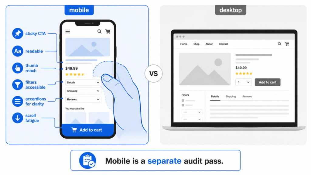
Mobile is not a smaller desktop. It’s a different context: thumbs, smaller screens, slower networks, and more distractions.
Sticky actions and CTA visibility
- Is there a sticky add-to-cart or key action on mobile PDPs?
- Does the CTA stay discoverable while users scroll through content?
Readability and information order
- Are font sizes, line heights, and contrast comfortable on smaller screens?
- Is the most important information (value prop, price, size, CTA) accessible without endless scrolling?
Thumb-friendly interactions
- Are tap targets large enough and spaced out?
- Are filters, menus, and carousels easy to use with one hand?
Accordion overload and scroll fatigue
- Have all details been dumped into accordions with unclear labels?
- Do users have to open 5–7 sections to get basic confidence?
Focus your Shopify mobile UX audit on one simple test: could someone complete a purchase on a mid-range phone with one hand, on average mobile data, without getting frustrated?
For heavier layout changes, this often overlaps with your Shopify design services work.
Step 6 – Evaluate Trust and Objection Handling
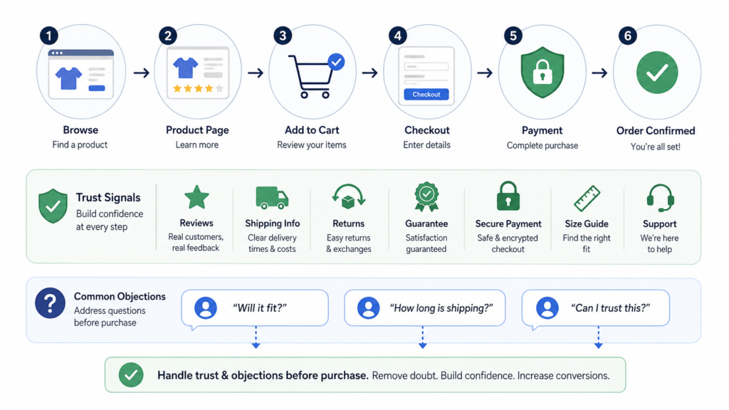
A surprising number of Shopify conversion problems are really trust and clarity problems.
Reviews and social proof
- Are reviews easy to find and filter?
- Do they include context (fit, use case, results) rather than just star ratings?
Shipping, returns, and guarantees
- Is the return policy visible before checkout?
- Are shipping times realistic and clearly stated?
- Are guarantees (e.g., “30-day trial”) short, specific, and believable?
Payment trust
- Are payment options familiar and secure-looking for your audience?
- Are badges or signals (SSL, secure checkout) used in a non-spammy way?
Product education
- Do you explain how to choose the right variant or configuration?
- Are there guides, size charts, or comparison helpers for complex products?
Make a list of the top 5–10 objections your support or sales team hears, then check where in the journey each one is addressed. Anything that’s only answered after purchase is a conversion leak.
Step 7 – Review AOV Drivers and Merchandising Opportunities
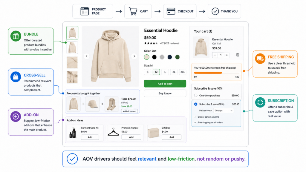
CRO isn’t only about conversion rate. It’s also about how much each customer spends.
Bundles
- Are bundles clearly better value than buying items separately?
- Are they easy to understand at a glance?
Cross-sells
- Are cross-sells truly complementary, or just random catalog items?
- Do they appear where users still have attention (PDP, cart), not buried at the bottom of checkout?
Add-ons
- Are small add-ons offered that naturally extend the main purchase?
- Is the logic obvious (e.g., “Add replacement filters,” “Add travel case”)?
Threshold incentives
- Are thresholds set at realistic levels, based on your current AOV?
- Is the progress bar clear and accurate?
Subscriptions (where relevant)
- If subscriptions make sense, are they explained clearly and ethically?
This is an area where a focused project like “How to increase AOV on Shopify” can emerge from your audit.
Step 8 – Check Analytics and Measurement Before Drawing Conclusions
You can’t run a serious CRO audit if your data is wrong.
Tracking completeness
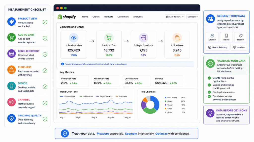
- Are key events tracked: product views, add-to-cart, begin checkout, purchase, subscriptions, key on-site interactions?
- Are there gaps between what you see in Shopify, your analytics tool, and ad platforms?
Funnel analysis
- Can you see where people drop off (between view → ATC → checkout → purchase)?
- Are you segmenting by device, channel, and campaign?
Traffic quality vs UX issues
- Are some channels driving low-intent, low-converting traffic?
- Do certain campaigns or keywords perform much worse on the same pages?
Before making big UX decisions, make sure you’re not simply looking at a traffic-quality problem.
This is also the moment to check your broader stack—tag managers, pixels, and integrations. If you’re working with more complex setups, your audit may overlap with Shopify app integration work.
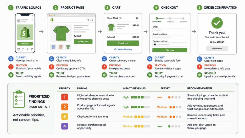
How to Prioritize Audit Findings
An audit without prioritization is just a long to-do list.
A simple framework:
- Fix now – High impact, low to medium effort, clear downside if left unfixed.
- Test next – High potential impact, but needs A/B testing or more validation.
- Monitor later – Low impact, or only relevant for specific segments or future stages.
To prioritize, score each finding across:
- Impact – How strongly could this move revenue, AOV, or a key funnel metric?
- Confidence – How sure are you that this is a real problem, supported by data and UX review?
- Effort – How difficult or expensive is it to implement?
Then sort by Impact × Confidence ÷ Effort and build a simple testing roadmap. This dovetails nicely with future content like “How to build a Shopify CRO testing roadmap.”
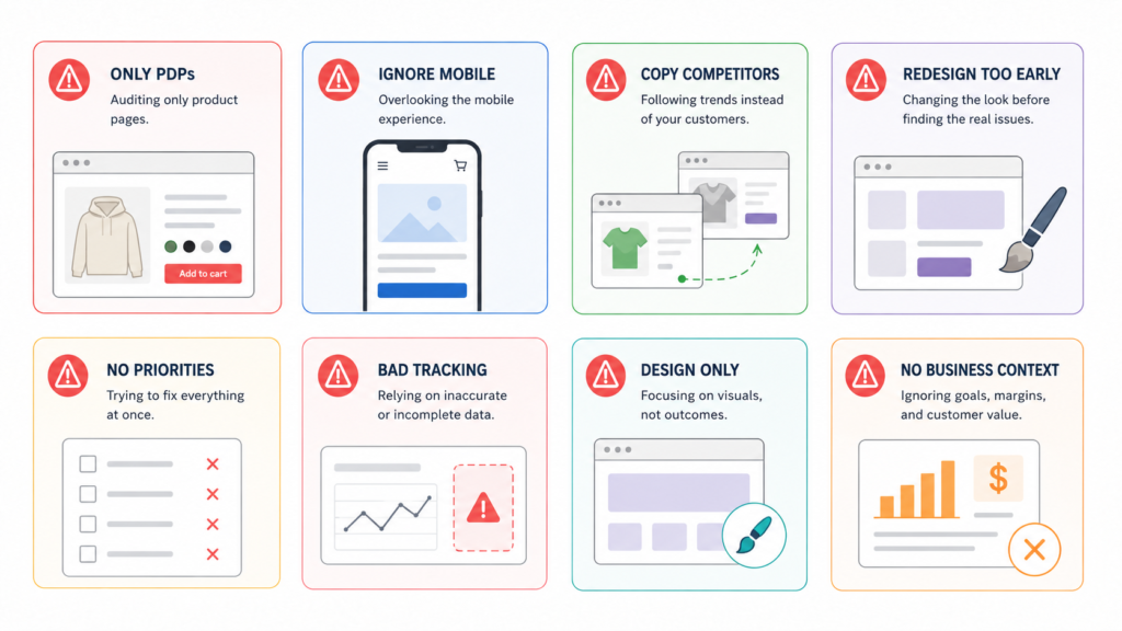
Common Mistakes in a Shopify CRO Audit
Avoid these traps when running your own audit:
- Focusing only on product pages – Ignoring traffic intent, collections, and checkout.
- Copying competitors blindly – You don’t see their data, only their surface.
- Ignoring mobile – Treating mobile as an afterthought even when it owns most of your traffic.
- Auditing design without business context – Commenting on looks instead of revenue impact.
- Jumping to redesign too early – Rebuilding the store without understanding where it’s actually broken.
- Making recommendations without prioritization – Delivering a 40-item list with no guidance on what to do first.
- Ignoring analytics quality – Making big decisions on top of incomplete or misconfigured tracking.
Your goal is not to produce the longest audit document. It’s to produce the clearest path to better performance.
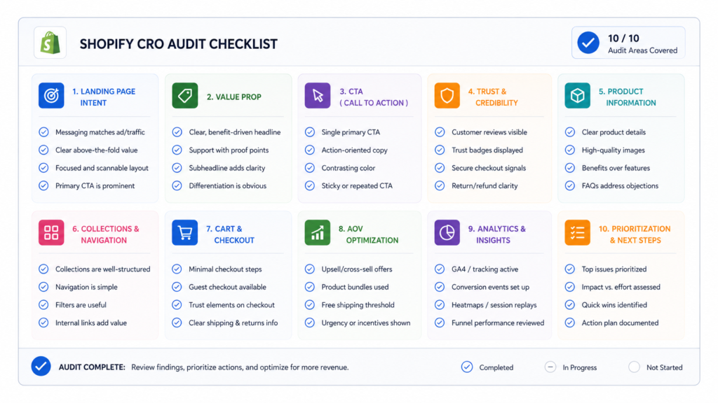
Shopify CRO Audit Checklist
Use this checklist as a quick pass or as the final QA after your audit:
- Is the landing page aligned with traffic intent for each major channel and campaign?
- Is the value proposition clear above the fold on key landing pages and PDPs?
- Are CTAs obvious, consistent, and easy to act on across devices?
- Are trust elements visible before the purchase decision (reviews, guarantees, policies)?
- Is product information easy to scan on mobile—not buried in accordions or tiny text?
- Do collections help users find the right products with clear filters and product cards?
- Is cart friction reduced (no surprise fees, clear editing, honest price display)?
- Are AOV drivers (bundles, cross-sells, add-ons, thresholds) relevant and well placed?
- Are key funnel actions properly measured and visible in your analytics?
- Are findings prioritized by impact, confidence, and effort, not just listed?
For a deeper dive, pair this with a dedicated Shopify CRO checklist.
Final Thoughts – Audit First, Then Optimize
A Shopify CRO audit is how you stop guessing and start prioritizing.
Before you redesign templates, change themes, or launch a dozen tests, make sure you understand where conversion friction actually lives and which fixes are most likely to improve revenue performance.
Done well, an audit will:
- Give you a clear view of the full funnel, not just isolated pages
- Reveal a handful of high-impact opportunities you can act on quickly
- Inform future work across Shopify CRO agency, conversion optimization services, and broader UX or design improvements
Need help auditing your Shopify store?
We help brands identify conversion blockers, prioritize the highest-impact improvements, and turn audit findings into a practical testing and implementation roadmap.
Talk to our Shopify CRO team to turn your audit into real, compounding gains in revenue and profitability.
Here are five ideas for 2D illustrations to complement the blog post:
1. The Four Lenses of a CRO Audit
Create a visual representation of the four lenses: Clarity, Friction, Trust, and Revenue Opportunity. Use icons or symbols (e.g., a magnifying glass for clarity, a roadblock for friction, a handshake for trust, and a dollar sign for revenue). Arrange them in a circular or grid layout to show they work together.
2. Conversion Funnel Journey
Illustrate the customer journey as a funnel, starting from traffic sources (ads, SEO, email) and narrowing down to checkout. Highlight key stages like landing pages, product pages, cart, and checkout. Use arrows or flow lines to guide the viewer through the process.
3. Before vs. After CRO Audit
A split-screen illustration showing a Shopify store before and after a CRO audit. On the left, depict common problems like unclear CTAs, hidden trust signals, and cluttered layouts. On the right, show improvements like clear CTAs, visible reviews, and optimized product pages.
4. Mobile vs. Desktop Experience
Show a side-by-side comparison of a Shopify store on mobile and desktop. Highlight mobile-specific issues like tiny buttons, hidden filters, or excessive scrolling, contrasted with a thumb-friendly, streamlined mobile design.
5. Prioritization Framework
Visualize the prioritization framework (Fix Now, Test Next, Monitor Later) as a pyramid or tiered structure. Use icons or colors to represent impact, confidence, and effort, with examples of tasks at each level.
6. Cart and Checkout Friction
Depict a customer encountering common checkout issues (e.g., surprise shipping costs, unclear totals) on one side and a smooth, optimized checkout experience on the other. Use simple characters or icons to show frustration vs. satisfaction.
7. AOV Drivers
Illustrate strategies to increase average order value (AOV), such as bundles, cross-sells, and threshold incentives. Use product mockups or icons to show examples like “Buy 2, Get 1 Free” or “Free Shipping Over $75.”