Velmare | Jewelry Brand
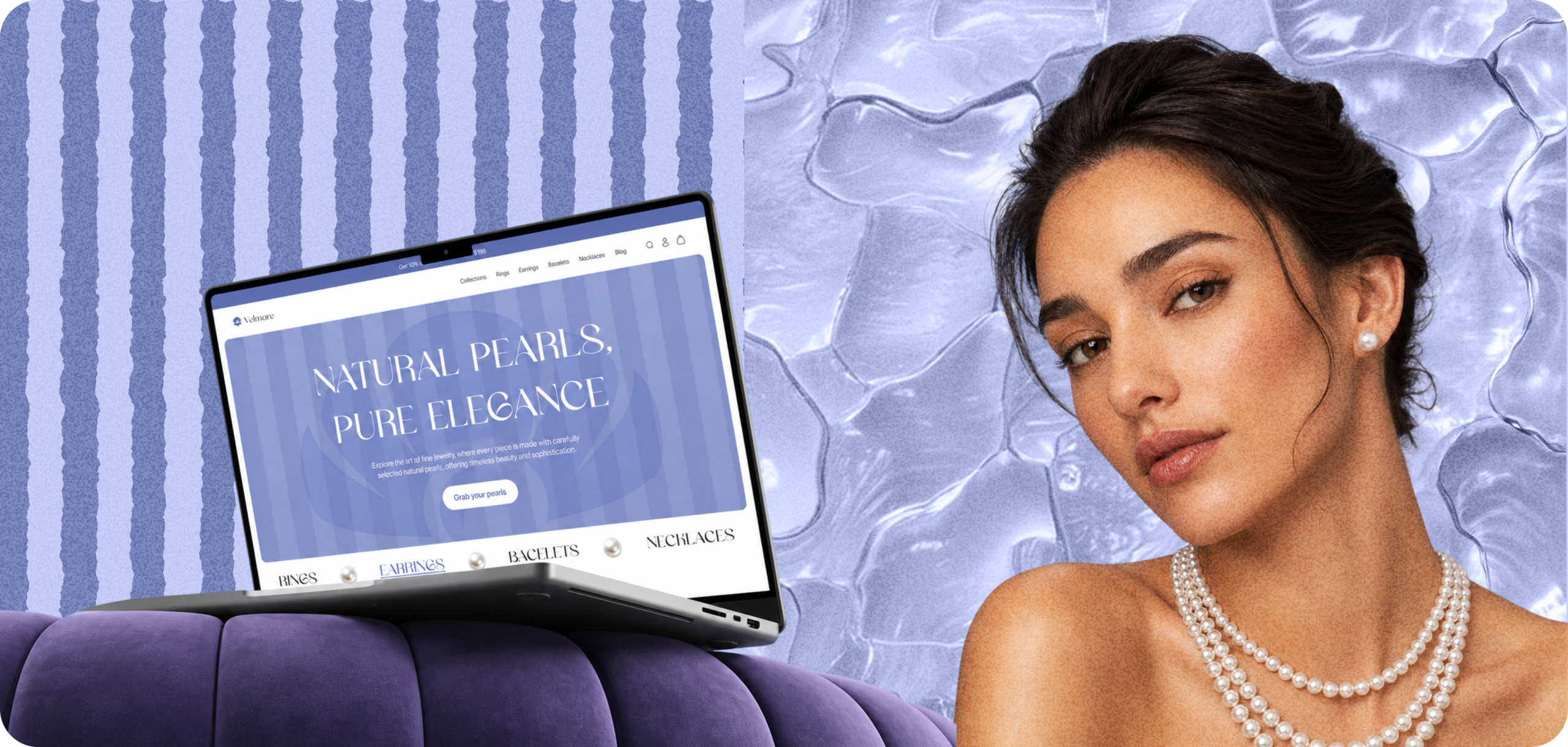
Velmare is a U.S.-based pearl jewelry brand specializing in elegant, high-quality pieces inspired by the natural beauty of pearls.
About the client
The company has its own production facilities and a strong understanding of craftsmanship, materials, and product quality. However, their previous WooCommerce website had been created more than 10 years ago and no longer reflected the brand’s current positioning.
After a full rebranding, including updated colors, logo, and visual direction, Velmare needed a new e-commerce experience that would match the premium quality of the products and support future growth.
Challenges
Velmare needed to redesign its outdated WooCommerce website and align it with the new brand identity, tone of voice, and premium market positioning.
- The client had invested heavily in rebranding, so the website had to become more than just a visual update. It needed to communicate elegance, trust, purity, and the unique atmosphere of pearl jewelry.
- The main challenges were to create a unique website inspired by pearls, the sea, and natural beauty, while keeping the shopping experience simple, clear, and conversion-focused.
- Another key challenge was increasing average order value for products that were already positioned as high-end. This required careful use of bundles, cross-sells, gift options, and premium add-ons without making the experience feel too aggressive.
- The website also needed user-friendly navigation, allowing customers to quickly search, compare, and discover products across different collections.
Project Goals
The main goal was to create a modern e-commerce website that reflected Velmare’s new brand identity and supported both sales and long-term brand perception.
We focused on creating a premium visual experience, improving mobile usability, simplifying product discovery, and preparing the website for future CRO and AOV optimization.
The website needed to help customers easily browse pearl jewelry by category, collection, style, and occasion, while also encouraging larger purchases through thoughtful product recommendations and premium add-ons.
Discovery Stage
We began the discovery phase by speaking with the client and learning more about their business, production process, product range, marketing channels, and delivery model.
- Several interviews helped us understand how Velmare’s products are manufactured, what makes the brand different, and how customers usually discover and purchase their jewelry.
- After that, we conducted competitor research. We divided competitors into two main categories: direct competitors in pearl jewelry and indirect competitors in the broader jewelry market.
- This helped us understand visual standards, product presentation, category structures, trust elements, and common CRO patterns used by premium jewelry brands.
Based on the discovery stage, we created a project roadmap, website structure, and design concepts for the new store. After receiving approval from the client, we moved into the design stage.
Website Creation Process
Our process started with business and product discovery. We analyzed the client’s goals, brand positioning, customer behavior, product categories, and existing website problems.
- Reviewed competitors and market references to identify what users expect from a premium jewelry shopping experience.
- Created the website structure, key user flows, homepage logic, collection hierarchy, and product page approach.
- Once the structure was approved, we moved into moodboards and visual direction. We reviewed the client’s logo, brand colors, product photos, and campaign images to define a design direction inspired by pearls, the sea, purity, softness, and elegance.
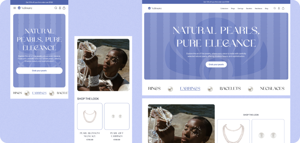
- The UX/UI design was created mobile-first, since a large part of the traffic comes from Instagram. After the mobile layouts were approved, we adapted the design for desktop and prepared the final pages for development.
Design Stage
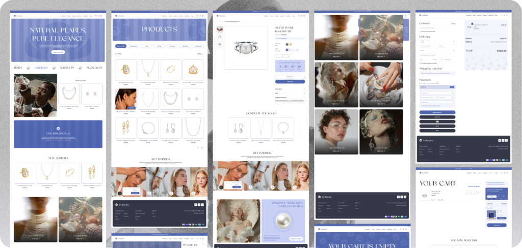
During the design stage, we focused on creating a clean, premium, and calm visual experience. The website needed to feel elegant without becoming difficult to use. We used soft spacing, large product visuals, refined typography, and a light visual atmosphere to support the feeling of purity and quality.
- We started by reviewing all materials provided by the client, including the brand logo, product photos, campaign photos, and updated brand assets.
- Defining the moodboard and visual direction
- Created UX/UI designs for the main pages, including the homepage, collection pages, product pages, cart, and supporting informational pages.
- The mobile version was designed first to make sure the shopping experience worked well for social traffic.
- The desktop version was then created based on the approved mobile structure.
UX Strategy
The UX strategy focused on making the website feel premium, but still simple and intuitive.
For jewelry shoppers, product details matter. Customers need to clearly understand the product, materials, size, color, care instructions, delivery options, and warranty before purchasing.
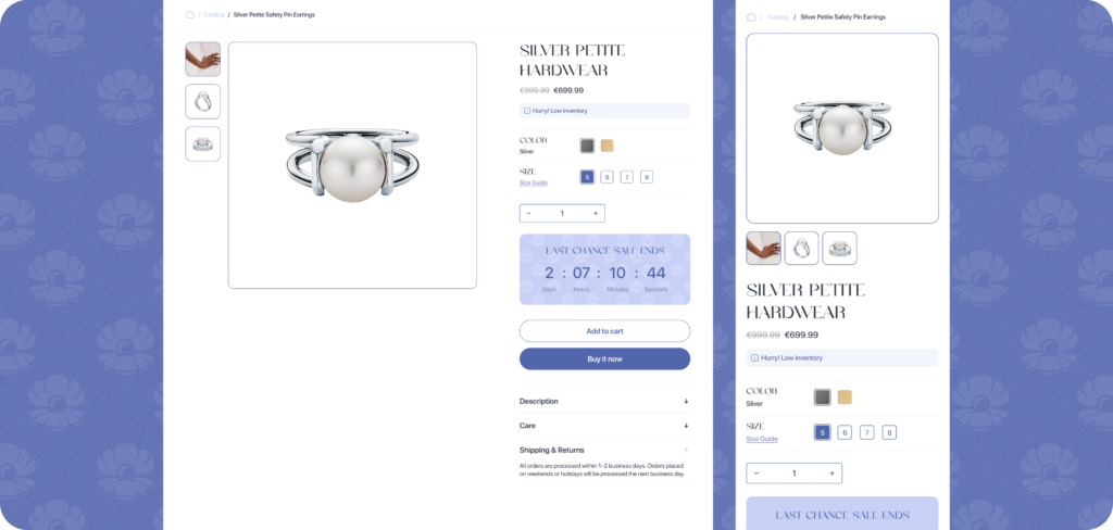
That is why we designed product pages with clear product visuals, simple controls, visible product details, and easy access to key information.
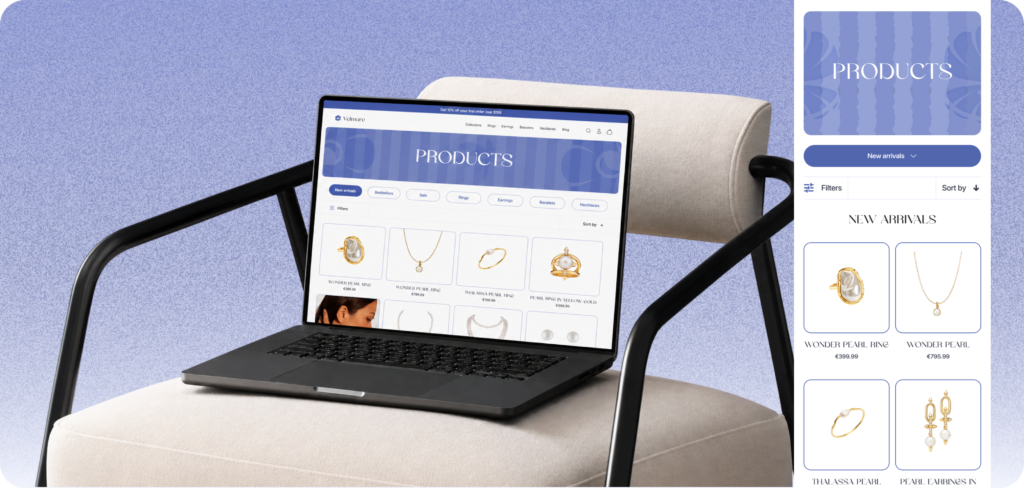
We also improved product discovery through clear navigation, collection-based browsing, and homepage sections that guide users toward product categories, new arrivals, limited collections, and featured products.
Since Instagram was one of the main traffic sources, the mobile experience was especially important. The goal was to help users move from inspiration to product selection as quickly as possible.
CRO Approach
To improve conversion rate, we focused on trust, product clarity, mobile usability, and a smooth path from browsing to checkout.
- The website uses a clean product page structure with large product images, clear product information, size and color controls, key product benefits, and a visible call-to-action.
- Trust-building elements such as product authenticity information, delivery and return details, secure checkout notes, warranty options, customer reviews, and care instructions.
- A key CRO feature was the “Shop the look” section. This allows customers to see a model wearing a product and immediately shop the exact item from the photo. This connects inspiration with direct purchase and works especially well for social-first traffic.
- Collection pages were designed to make browsing simple and visual. Customers can explore products by category, collection, style, or occasion, helping them find the right jewelry faster.
- Prepared the website structure for future A/B testing, including tests for product page layouts, CTA placement, bundle offers, urgency signals, and cart upsells.
AOV Approach
To increase average order value, we focused on complementary products, premium add-ons, and occasion-based purchase behavior.
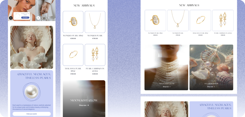
- Many pearl jewelry products naturally work well together, so we used bundles and matching sets to encourage customers to buy more than one item. For example, earrings, necklaces, and bracelets can be combined into a complete look.
- Used “Complete the look” recommendations to suggest products from the same collection or items that visually match the selected product.
- For special occasions, the store can promote curated sets such as bridal sets, evening sets, gift sets, or limited-edition collections.
- Gift wrapping is another strong AOV opportunity for jewelry brands. Since many customers buy jewelry as a gift, paid gift packaging can increase order value while also improving the overall buying experience.
- Other AOV mechanics include free shipping over a specific order amount, premium delivery options, jewelry care kits, and lifetime warranty add-ons.
- These ideas were included in the UX/UI foundation and can be tested after launch to understand which offers perform best.
Cart Experience
The cart experience was designed as an additional conversion and AOV layer.
- Instead of showing only selected products, the cart can help customers complete their purchase with relevant add-ons and reminders.
- Inside the cart drawer, we planned several AOV-focused elements, including a free shipping progress bar, gift wrapping option, jewelry care kit add-on, premium delivery option, lifetime warranty option, and “Complete the set” product recommendations.
- The goal was to increase order value at the final stage without slowing down checkout.
- The cart also keeps the buying process simple by showing a clear checkout button, product summary, and key trust notes such as secure payment, delivery, and returns.
Results and Next Steps
The new website helped Velmare align its online presence with the updated brand identity and premium market positioning.
The redesigned experience made the store feel more modern, elegant, and trustworthy, while also improving product discovery and mobile usability.
The new structure created a strong foundation for future CRO and AOV optimization, including testing bundle offers, gift packaging, free shipping thresholds, product recommendations, and cart upsells.
As next steps, we recommended continuing with A/B testing, analyzing customer behavior, improving product page performance, and expanding the content strategy around pearl jewelry, gift guides, styling ideas, and product care.