Dermavia+ | Healthcare Shopify Store
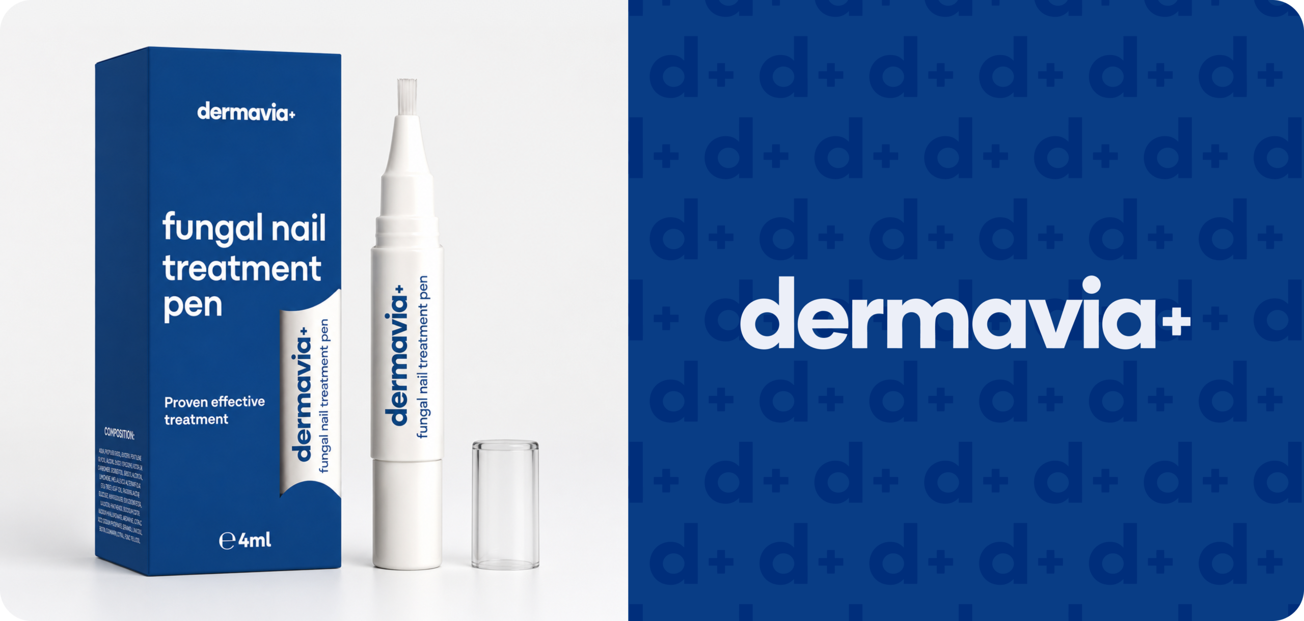
Dermavia is a health and beauty brand focused on nail care treatment. The product is positioned as a simple at-home solution for customers who want to improve the look and condition of affected nails without a complicated routine.
About the client
Dermavia is a health and beauty brand focused on at-home nail care. Their main product is a fungal nail treatment pen designed for targeted application on toenails and fingernails. Before launching their own Shopify website, the product was primarily sold on Amazon and already had strong customer validation, with 400+ reviews.
The goal of the project was to help Dermavia build a direct-to-consumer sales channel outside Amazon. We created a conversion-focused Shopify website that clearly explains the product, builds trust, highlights customer reviews, and helps users choose the right pack size for their needs.
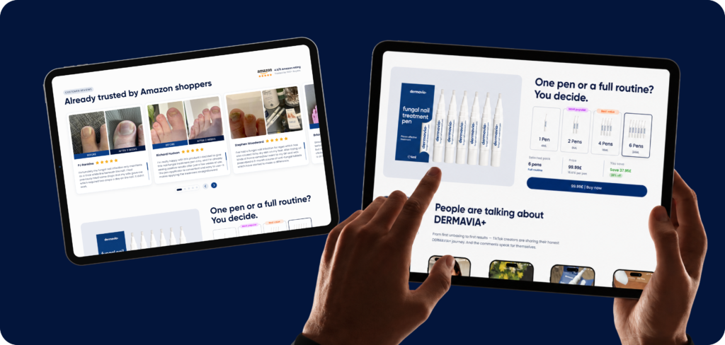
The website was structured around product education, trust, CRO, and AOV. We added sections for product benefits, how it works, before/after proof, reviews, FAQ, pack selection, and clear CTAs. A key part of the strategy was offering 1, 2, 4, and 6 pen packs to increase average order value and support longer product usage.
Challenges
Dermavia needed more than a basic product page. For a health and beauty product, customers usually need education, trust, reassurance, and clear expectations before they are ready to buy.
The main challenges were:
- Explain what the product is and who it is for
- Make the product feel trustworthy and easy to understand
- Create a stronger buying journey for a one-product Shopify store
- Help customers choose the right pack size
- Support higher AOV through multi-pack offers
- Build a mobile-first experience for paid traffic and direct response campaigns
Solution
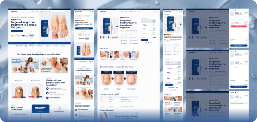
We created a focused Shopify structure built around education, trust, and conversion.
Instead of sending users directly to a simple product page, the website experience was planned as a guided journey: problem awareness, product explanation, usage instructions, proof, pack selection, and final checkout.
The result is a more conversion-focused ecommerce experience that helps customers understand the product faster and make a more confident purchase decision.
Our approach
We started by defining the key customer questions:
- What is this product?
- Is it right for my problem?
- How does it work?
- How long should I use it?
- How many units do I need?
- Can I trust this brand?
- What happens after I order?
Based on these questions, we structured the website around clarity and reassurance.
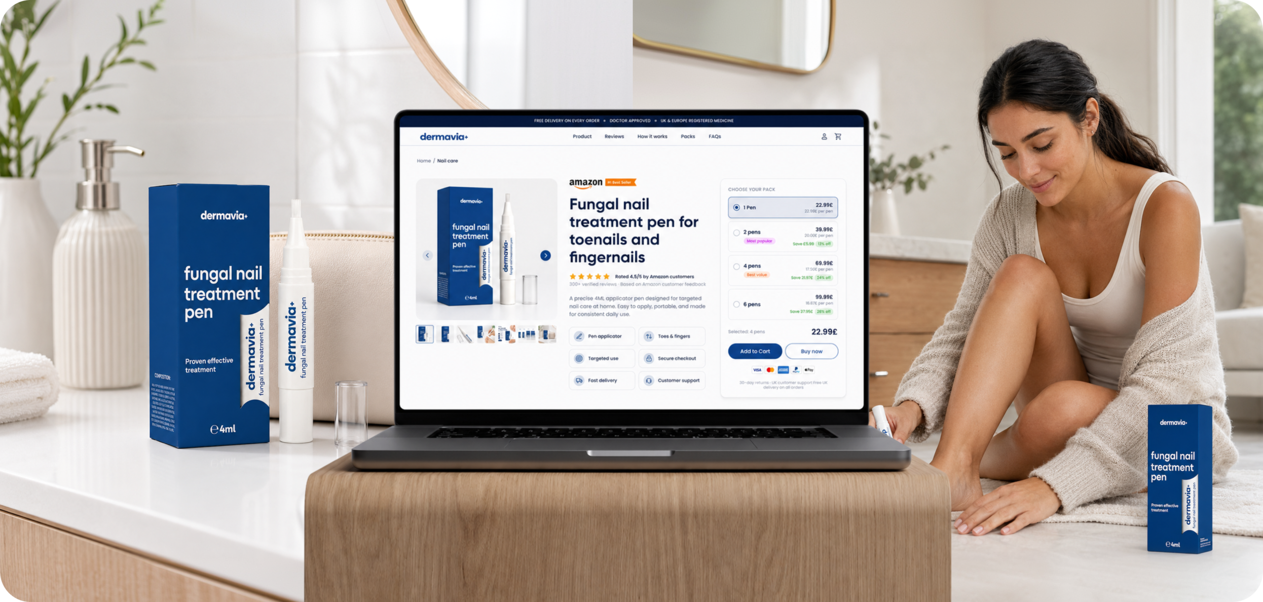
The website flow was planned around the main conversion pages:
- Homepage
- Product page
- Pack selector
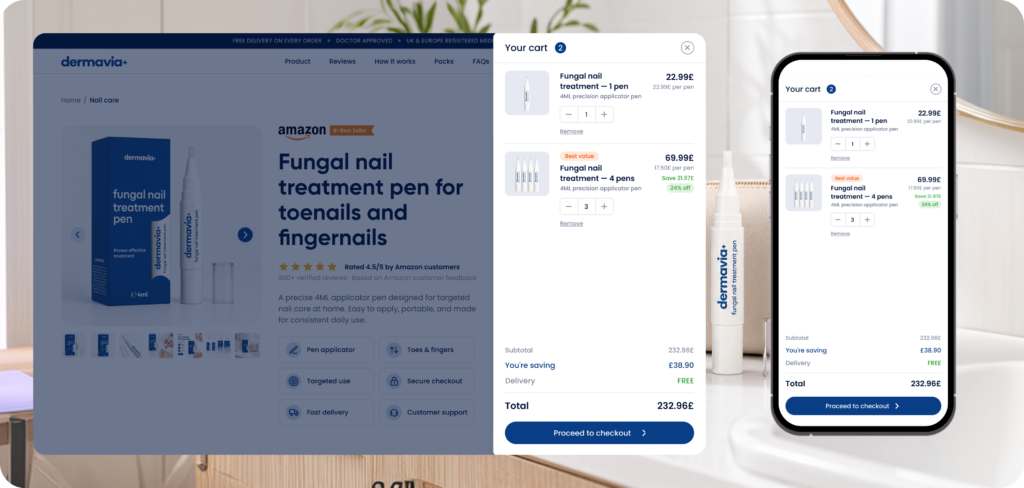
- Cart drawer
- Reviews and trust sections
- Shipping, returns, refund, privacy, terms, and contact pages
The homepage introduces the product and explains the main value proposition. The product page presents the full buying case with benefits, usage guidance, reviews, an FAQ, and pack options. The cart drawer supports the final decision with a simple order summary, trust signals, and upsell logic.
CRO, AOV, UX Approach
CRO approach
The CRO strategy focused on reducing hesitation and making the purchase decision easier.
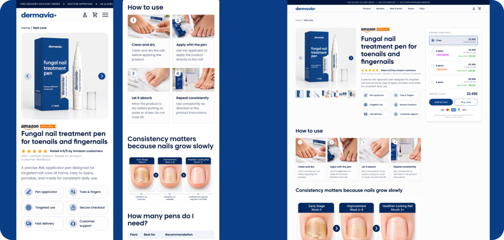
Key CRO elements included:
- Clear hero section with product image and direct CTA
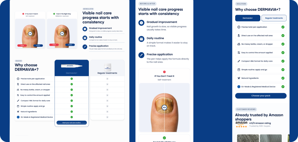
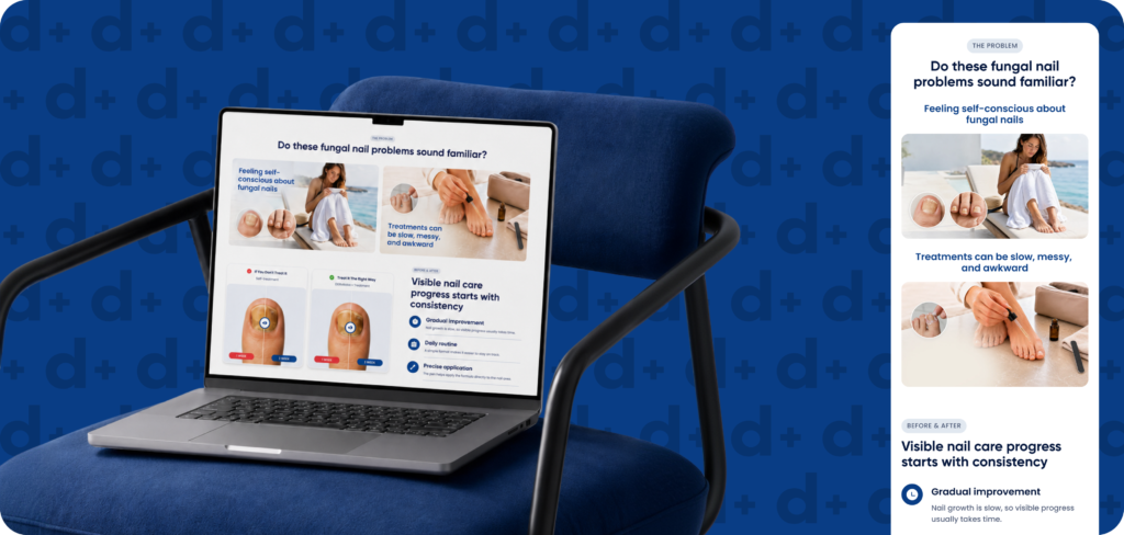
- Problem/solution section to connect with the customer’s need
- Benefit-led product explanation
- “How it works” section with simple steps
- Usage timeline to set realistic expectations
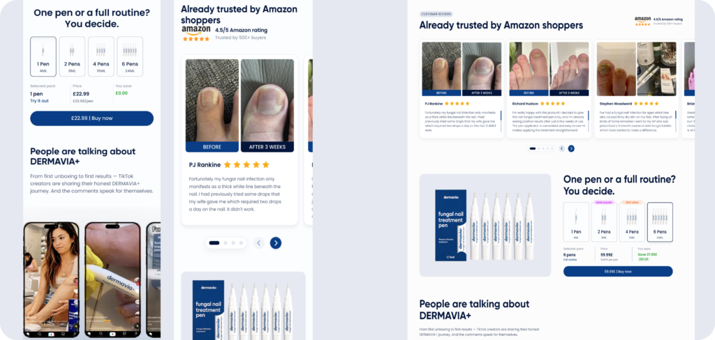
- Review and trust sections
- FAQ section near the purchase area
- Sticky mobile CTA
- Trust signals near the Add to Cart button
- Clear shipping and returns links
AOV approach
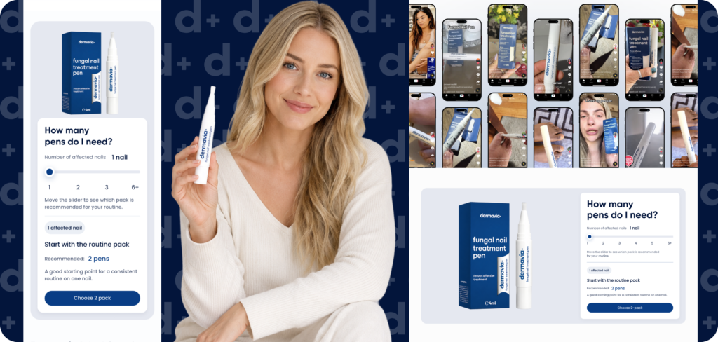
The AOV strategy was built around pack selection.
Instead of selling only one unit, the website encourages customers to choose the right pack based on their treatment needs.
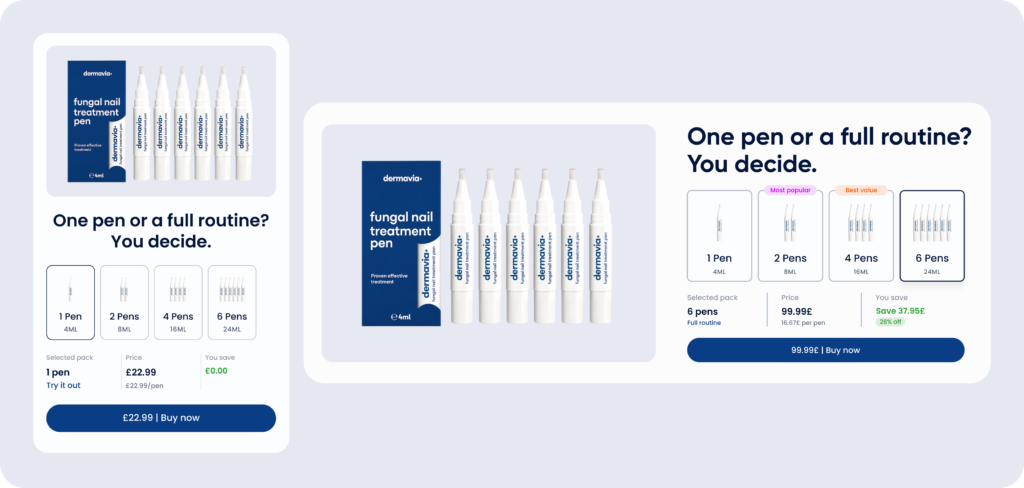
Recommended pack logic:
- 1 pack for trial or light use
- 2-pack for one affected nail or a longer routine
- 4-pack for multiple nails
- 6-pack for best value and full treatment support
This helps customers understand why a larger pack may be more practical, not just more expensive.
AOV improvements included:
- Best value badge on the recommended pack
- Savings shown clearly on multi-pack options
- “How many do I need?” section
- Cart drawer upsell for adding an extra pack
- Free shipping threshold, if available
- Bundle-style pricing presentation
UX approach
The UX approach was focused on simplicity, especially for mobile users.
The buying journey was designed to feel calm, clear, and easy to follow. Since the product requires trust, we avoided overwhelming layouts and focused on clean sections, short copy blocks, clear icons, and repeated CTAs at natural decision points.
Important UX decisions included:
- Mobile-first product page layout
- Clear product images above the fold
- Simple pack selector
- Easy-to-read benefit cards
- Step-by-step usage section
- FAQ accordion
- Reviews placed before final CTA
- Trust and policy links near checkout
- Minimal navigation to keep users focused
Results
The project created a stronger conversion foundation for Dermavia’s Shopify store.
Key outcomes:
- Clearer product positioning
- More trustworthy health and beauty shopping experience
- Improved customer education before purchase
- Stronger product page structure
- Better multi-pack presentation
- Higher AOV potential through pack-based buying logic
- Cleaner mobile shopping journey
- More complete Shopify store setup with essential trust and policy pages
The final website structure gives Dermavia a better base for paid traffic, product testing, CRO improvements, and future ecommerce growth.