
10 Simple tweaks for the Shopify website to increase CRO and Average Order Value
These techniques are easy to apply during the design or development stage of a website. At our agency, Webspirit, we strive to apply these top 10 techniques and others to our clients.Most of CRO involves following best practices and constantly monitoring and improving. Simple notification banner at the top of the page You couldn’t ask for […]
These techniques are easy to apply during the design or development stage of a website. At our agency, Webspirit, we strive to apply these top 10 techniques and others to our clients.
Most of CRO involves following best practices and constantly monitoring and improving.
Simple notification banner at the top of the page
You couldn’t ask for a better place for notifications. This is the spot that 100% of site visitors see, and they’ll know that you offer free shipping on orders over $100. Important, concise information that is easy to understand fits perfectly on this banner. It doesn’t clutter the page with large icons and notifications, and there are no annoying pop-ups. Simple and effective.
You can go further and simplify this line a little if you have more than one message to display. You can add a slider so that the information in the line changes after a specified time or when the arrow is clicked. You can also add a play/pause button to stop automatic scrolling. You can also add a button to the line so visitors can go directly to the page with the information they need, such as the “Terms and conditions for guaranteed returns”.
Hurry up on the product page
Simple notifications on the product page can encourage customers to buy and create the impression that the offer is limited. Such notifications are ideal for discount and sale seasons, as well as for products on promotion.
You can use simple banners with notifications such as “Only 5 left” or “Will be out of stock soon”.
You can also use a countdown timer for discounts and sales. For example, if there is a discount on this product until the end of the day, you can set a timer on the product page that counts down to the end of the day.
Complete a look or another Bundle Builder
There are several different ways to use this approach with Bundle on the page. The idea is to show products that are either very similar to this one, from the same collection, or that pair well with it. For a clothing brand, this could be a top and leggings; for a cosmetics brand, it could be a face wash and a mask. Products that are used together and complement each other
h other.
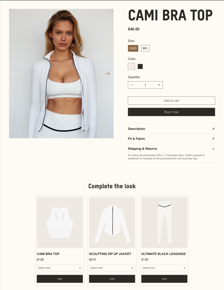
In the image below, you can see the product page for the top, and in the next section, we recommend a T-shirt, jacket, and leggings from the same collection. This is the product page for our Essense Flow case study, which is described in more detail on our website.
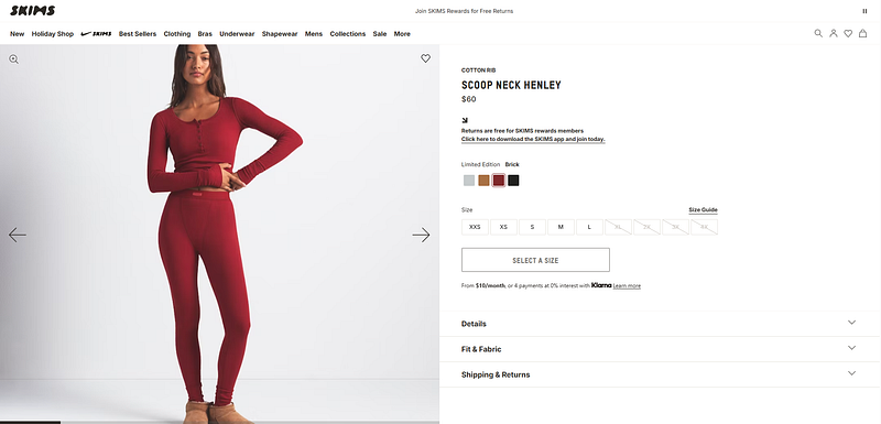
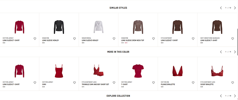
This idea is very well illustrated on the Skims website. Let’s take a round-neck T-shirt as an example.
In the next block on the page, we see products from the same image that perfectly complement this T-shirt. To avoid redirecting the user to another page, the product card immediately offers to select a size and add it to the basket. The visitor does not need to take any additional steps, just select the size and add it.
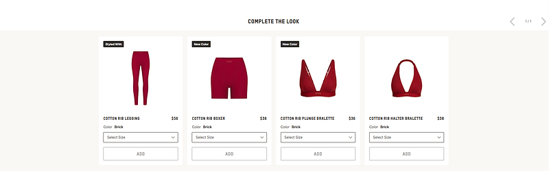
Further down the page, you can find similar products from the same collection, similar products in style, or similar products in colour. Everything is designed so that you don’t leave the page, but follow the algorithm.
Sell Outfits, not just a Product
This doesn’t really apply to cosmetics brands, so let’s look at an example from another website.
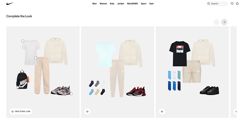
It’s a great idea to create a section on your website that shows an outfit and provides an immediate link to the product page.
Or where a model is wearing an outfit, and you add all the products from that outfit.
For a cosmetics brand, it could be a “Morning routine image,” showing a set of products for morning or evening skin care, along with comprehensive results from using them, with before-and-after photos.
For example, the Nike product page shows a tracksuit and sneakers as one outfit option. Users can immediately add products to their cart. At this stage, it is important to make a “smooth” transition and add new products so that users do not leave the landing page and do not get confused
UGC content on the product page
This recommendation can be divided into two parts:
– What do you use on your website?
– What do you use on social media?
Any positive mention of you on social media is a big plus for getting more people to see your product and get interested in it. We won’t go into SMM and look at options for placing your product with bloggers to create UGC content or just customer reviews.
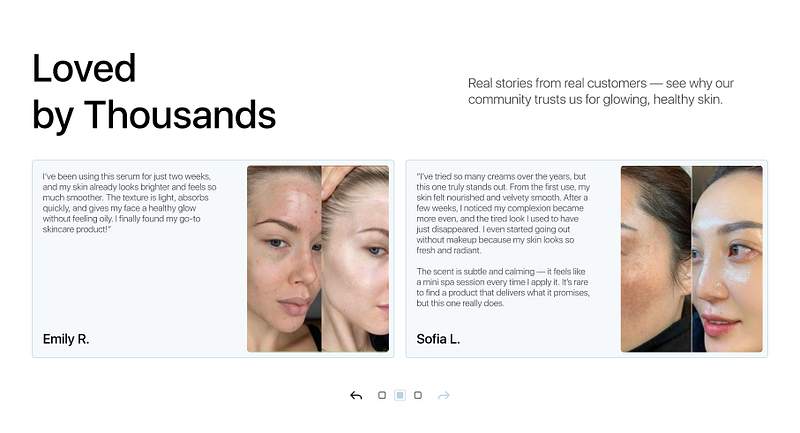
Let’s talk about the website. UGC content or reviews on the website create more trust between your brand and potential buyers. They see that this product is already being used; here are some ways it can be used, etc.
In our case, we used UGC content in the reviews section to immediately show customer reviews and real examples of how the cosmetics are used.
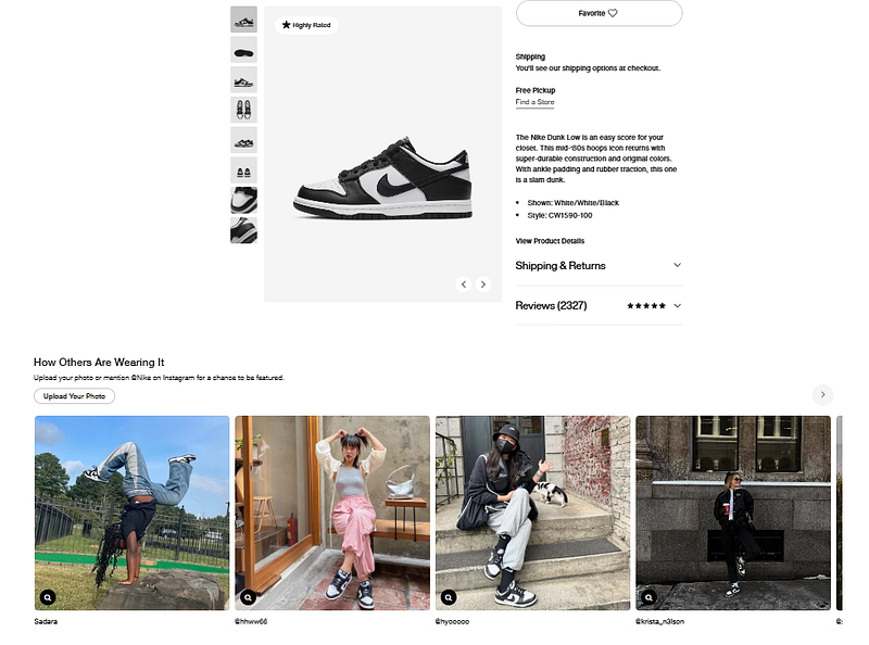
Another good example is Nike. They publish your photo on the product page if you tag them on Instagram.
This tool can be used in different ways, such as through Instagram, TikTok, and other platforms, or by directly requesting customer feedback.
Gift Cards
An old but proven way to get income now and postpone the delivery of goods or services. This method still works, depending on how you apply it.
For example, if my friend likes a cosmetics or clothing store and I don’t know exactly what to get him as a gift, I can use a gift card for a specific amount to make a purchase.
It’s a very simple method from a technical standpoint and a great idea for a quick, easy gift.
“Add to Cart” banner following you
Using the ideas for the product page described above, your page will be quite long, but informative. To keep the customer’s focus and avoid unnecessary actions on the site, simply add a small banner at the bottom of the page and an “Add to cart” button that will follow it down the page.
Product-oriented sections
Another idea for a section focused on the product. The example shows a section that displays a product usage option and a product card for immediate access. This way, you don’t create useless sections, but you immediately show the product and give a clear CTA that lets people view and order it here.
Cart that upsells
Simple but very effective advice. Recently, I was going to a ski resort and visited an online store to buy some small items. I needed a ski mask.
The shopping cart suggested a balaclava and ski socks, which I didn’t have and seemed very appropriate.
This is one example of how you can increase the average check and make up-selling useful for the customer.
Free shipping threshold bar (with dynamic progress)
And last but not least, my favorite method is a progressive scale in the shopping cart that shows “How much more to get free shipping.”
The best approach is to set the threshold slightly above your current average order value — ideally by the price of a common add-on (travel size, lip balm, remover, accessories).
What value to use
Best starting formula:
Threshold = (current AOV) + (price of your “easy add-on” item)
Example:
AOV = $42
Easy add-on (travel size, lip balm, remover) = $12
Threshold = $54 (round to $55)
Why: it nudges people to add exactly one more thing, not struggle to add 3 items.
Could be built with Shopify Apps such has Essential Free Shipping Upsell